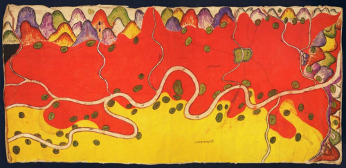
 In the late 1800s the Burmese already had a good appreciation for topographic mapping and cartography in general. They used maps for taxation and land use and also as a way of plotting military campaigns. Many of these maps were collected by British diplomats and also colonial authorities but in addition, indigenous maps by the Shan and T’ai peoples were also collected. Here, a Shan map created in 1889 relating to a border dispute between Burma and China illustrates wonderful cartographic approach using colour to represent the different areas.
This map was painted by an anonymous Shan artist in tempera on paper and it covers an area of 47 square miles along the Nam Mao (Burmese Shweli) River. There are about eighty villages and hamlets shown in green. The map text is in Chinese Shan with red areas representing the British Shan state of Möng Mäo and yellow showing Chinese territory. The colours are rich and vibrant and leave the reader in no doubt as to land ownership.
Most of the map is planimetric but the mountainscapes on the upper and right borders show the bounding mountain ranges in aspect with wonderful colour. By modern standards there’s considerable cartographic license in terms of the precision of the topographic record. In design terms, the map is a work of art and a quite sumptuous representation.

