MapCarte 223/365: Mammoth Mountain by James Niehues, 2008

MapCarte223_niehues


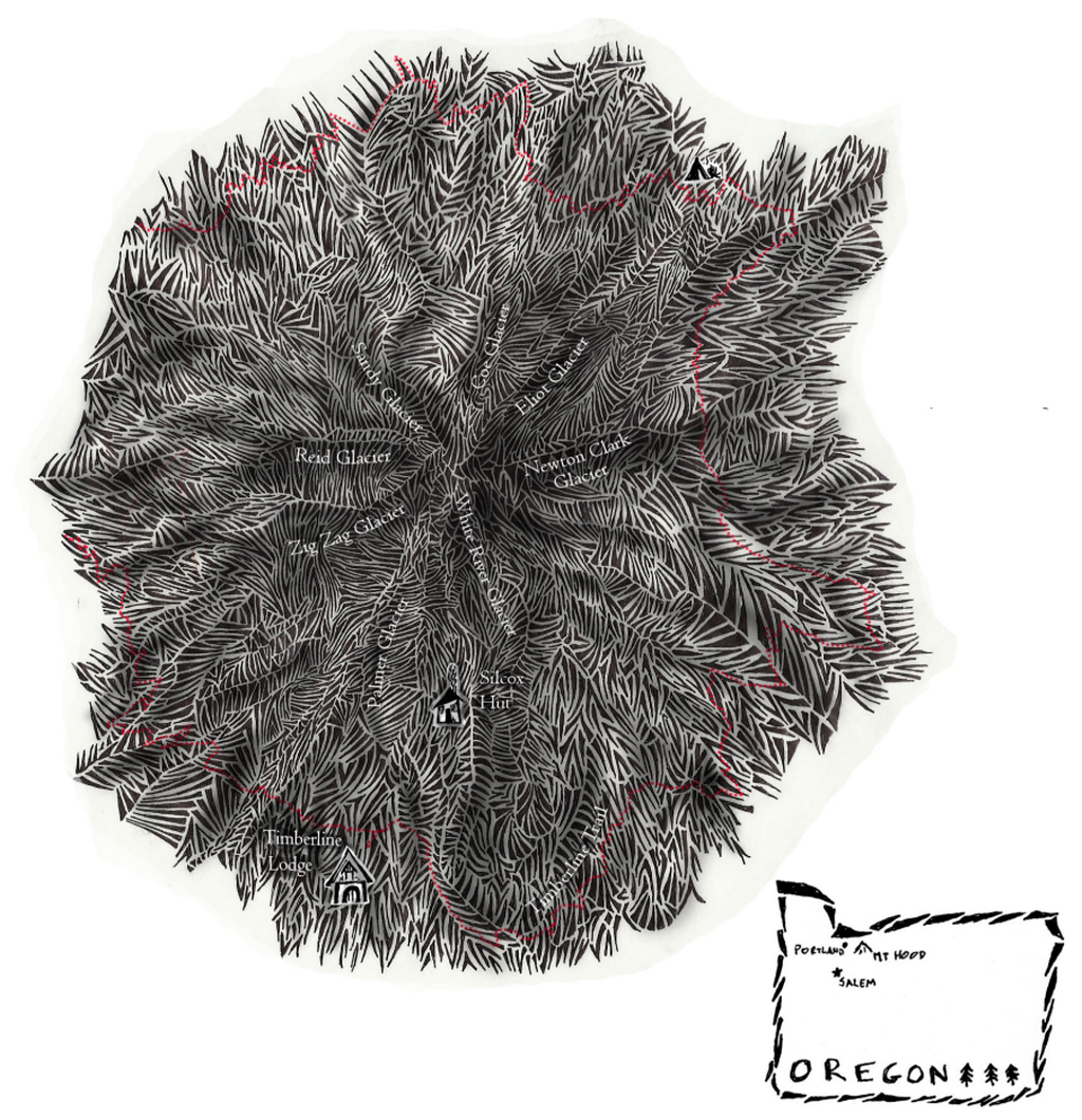
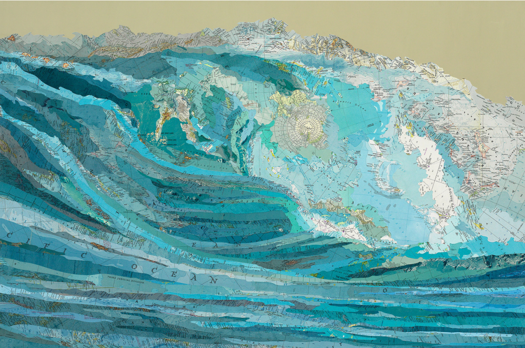
The basis of many outdoor recreational maps is a good topographic map. If the recreation makes use of a mountain and it involves descending the slopes whether by ski, snowboard or mountain bike then the interest is in the mountainsides and a planimetric map just doesn’t provide the right aspect. Most ski trail maps show the mountain in aspect or as an oblique image so we see the trails running from top to bottom down the map itself. One of the big problems in making maps of this type is how to fit trails that descend in different orientations down a map so they are all shown equally well.

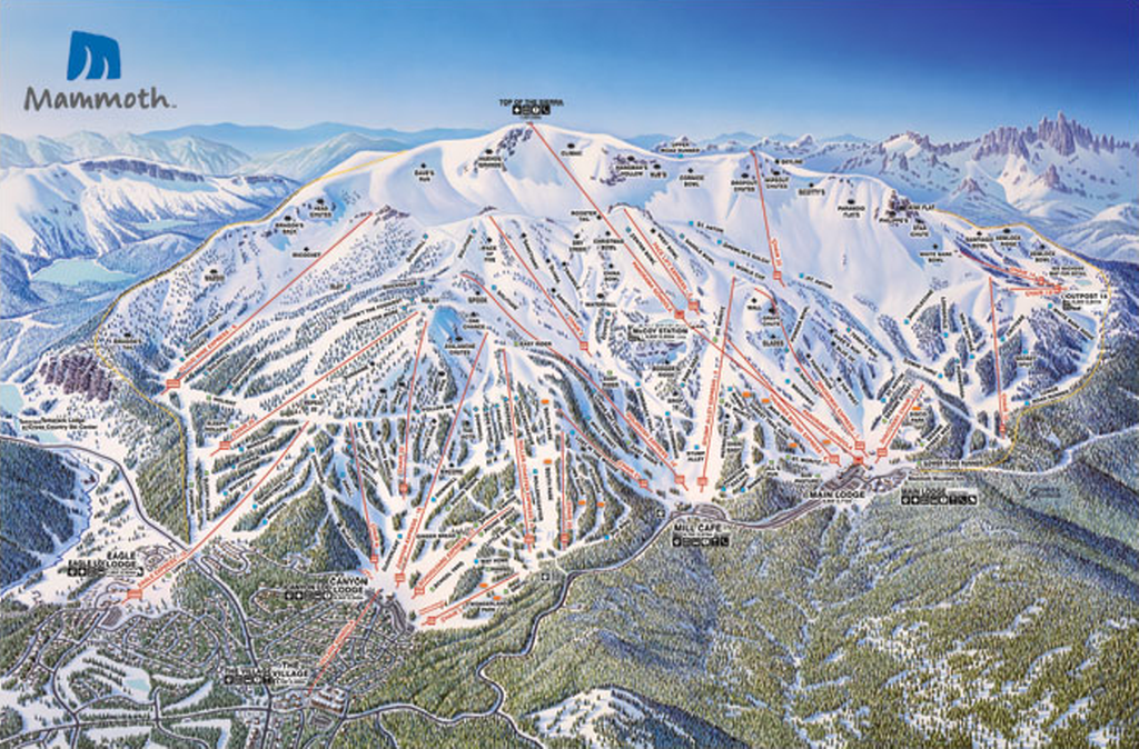
Many landscape painters and artists have been involved in drawing and painting panoramas that support ski trail mapping for decades. James Niehues has painted many of North America’s resorts and mountains as well as many overseas locations. His unique approach involves aerial surveys followed by a drawing that warps the landscape to rotate the trails toward the front. It’s a form of exaggeration and displacement, long held generalization techniques but here applied to a painted landscape. His final painting in exquisite detail and rich colours is a beautiful object in its own right. Here, his painting of Mammoth Mountain in northern California shows the volcanic peak as the key feature with a good deal of artistic license but nothing that isn’t unrecognisable or topologically incorrect. It still supports on mountain navigation perfectly. His trees are particularly impressive, each one placed and painted individually and the townscape, horizon, haze and skies add to the drama and beauty.

MapCarte223_mammothOnce the skit resort has added their lift lines and trail markings to designate difficulty, the map takes on a more functional purpose but the painting and geometric symbols that overlay work in harmony. Text is applied to name different features and runs and the map has not only form but function.

Painted panoramas give us a beautiful way of seeing a landscape. They also provide the backbone and a perfect canvas for this very specific type of recreational map. Niehues’ work sits at the peak of ski resort panorama mapping.

You can see much more of James Niehues’ work on his web site here.


MapCarte 219/365: Kara’s Wave by Matthew Cusick, 2009

MapCarte219_cusick


No list of aesthetically pleasing maps would be complete if every once in a while we didn’t delve into the purely artistic form. Maps are, after all, beautiful objects in their own right and ignoring their possible function as tools for communication they perform a function as a piece of visual art. This is the reason why many people hang maps on their walls, even paper their walls with maps or collect map-related objects.

Matthew Cusick approaches maps as part of a palette of colour, shade, texture and meaning which he weaves onto the canvas along with acrylic paint. Rather than simply using just paint, he uses pieces of maps from which he creates a collage to bring to life an artistic work. Kara’s wave makes considerable use of topographic maps and bathymetric charts. He has built a picture of the wave using maps and at a distance it appears no different to any other painting. Placement of the maps is not accidental or random. The shapes of the pieces gives shape to the overall piece and we can see the swirling mass of water take shape. Textual components follow the same lines and ingeniously, a polar azimuthal projection of Antarctica is used as the fulcrum of the crashing wave…the circular shape adding to the motion and the white landmass suggesting the foamy wash.

Maps as art give them a new life perhaps when their original purpose has waned. They certainly give artists a rich medium with which to work. Cusick has many other examples such as an image of a car…made predominantly of street maps which blends the map type perfectly with the picture’s theme once again. Many more of his works can be seen on his web site here.

MapCarte 205/365: Manchester Music Map by CreativeLynx c.2002

MapCarte205_manchester


Making a map to support rourism requires two important design considerations – the content must be unique and speak to the audience; and the design must be attention-grabbing. Manchester’s music scene arguably provides the first in abundance given the number of iconic musicians and bands that hail from the area. Creative lynx came up with an aesthetic that did the second job.

This fantastic cartoon-styled map throws geography and scale out of the window. It’s useless as a tool for navigation but, instead, it emphasises key spaces of historical significance to some band or other. Places, buildings, venues and meeting spots are located. These are the important places for this map.  It goes beyond that by positioning the musicians in amongst the city itself, showing them taking ownership of Manchester and in so doing, defining its cultural relevance. Interest is encouraged through varying sizes of the main characters so you are invited to go beyond the larger figures to find and figure out who the smaller ones are.

A heavily stylized tourist map that supports the intended purpose and to develop a particular sense of place.

MapCarte 197/365: Tokyo by Benjamin Sack, 2014

MapCarte197_tokyo


Perspective illustrations of cities and landscapes have always been maps that inspire. They tend to be highly illustrative and show places in detail. This example of Tokyo by Benjamin Sack is both typical of the genre but also unique in that it takes the rendering of the environment to an incredibly detailed level.

The map uses a typical perspective view which incorporates foreshortening. While creating difficulties in measuring from place to place it’s a highly effective way of rendering an image that mimics the human point of view. What Sack does well is use shadow and depth of ink to make the background darker. This creates an illusion of depth in the image. The foreground water uses some subtle texture to create a more interesting image.

MapCarte197_tokyo_detailOverall, a beautiful map that uses light and dark to great effect and which illustrates the power of black and white maps.


MapCarte 196/365: Trees, cabs and crime by Shawn Allen, 2009

MapCarte196_trees


Three colour print technology is based on the principles of the subtractive colour model whereby magenta, cyan and yellow pigments are combined to create pigments that absorb certain wavelenghts of light. We begin with a white background and mixing gives us a full palette of subtractive colours.

Why not use it to create a trivariate thematic map which illustrates the density and overlap of certain features as they occur in the environment. This map uses equally sized circle symbols representing three separate features in San Francisco. While they possibly cannot be said to correlate to one another in a causal sense we get a clear idea that trees signify a particular type of landscape, that cabs tend to concentrate in the north east and the downtown area and that crimes occur throughout. Interestingly, the mixing of the subtractive colours gives us reds, blues and greens showing the predominance of two of the variables…and occasionally some black showing the presence of all three in close proximity.

Crime tends to appear on east-west streets rather than north-south but the main outcome of the map is to see the city through a different lens through subtractive blending.

A neat reworking of a well established technique that creates a visually interesting map and one which perhaps has further utility.

A web map version can be seen here.

Ed notes…details here.

MapCarte 193/365: London Underground Circuit Map Radio by Yuri Suzuki, 2012

MapCarte193_tubecircuit

There are not many maps that would be included in any list of great examples of design that are based entirely on another map to the extent that they are practicaly copies. This map, we feel, is different. For a start it is based on one of the most iconic maps and a design classic – the Beck tube map of the London Underground railway. So it’s got ‘good bones’ which is a start. But the inclusion of Suzuki’s map here is simply because he has turned a classic into something altogether different.

This map is a radio. Suzuki has built a map in the form of the London Underground map that operates as a transistor radio. The circuit board plots out the map’s lines and various components on the radio such as transistors and dials, form stations and interchanges. The marriage of form and function may at first seem baffling but Harry Beck was an electrical draughtsman and though he was supposed to have based his own map on an electrical circuit this was somewhat of a myth. Suzuki, though, has used this as homage to Beck and created the diagram as an electric circuit. He also builds upon a version of the actual map drawn by Beck some years after the original that was in the style of a real electric circuit…a response to some of the comments he had received about the similarities to an electric diagram.

MapCarte193_tubecircuit_detail

Suzuki has created a wonderful object. The map is an undeniable classic but building upon the idea of the map as an electric circuit brings is fitting. A great piece of map art…that has form and a function.

MapCarte 191/365: European car manufacturers by KHUAN+KTRON, c.2010

MapCarte191_khuan

Illustrative maps are always good value in magazines and for poster designs. Many tend towards the abstract as a way of capturing attention and graphic design studio KHUAN+KTRON are known for their characteristic colourful illustrations for magazines such as The Good Life, Wired and Monocle.

Their work tends to be playful and somewhat eccentric in style and in many respects their work mimics more general pop culture references. This is nowhere more in evidence than in their series of maps which have become a signature style. Produced for a range of clients, they combine a cartoon-like aesthetic with a good dose of humour.

This example, produced for The Good Life magazine to accompany an article on the European Car Manufacturing industry is an excellent example of their maps. Bright, colourful in a limited palette and with an abstract pictorial representation of trees, mountains, landscapes, buildings and, crucially, the factories of the car manufacturers themselves.

Proving that a potentially dull subject matter can be turned into a beautiful map, KHUAN+KTRON have created a unique and vivid set of maps.

More maps in a similar style can be seen on their web site here.

MapCarte 190/365: Cartographer’s Handscapes by Angela Dorrer, 2013

MapCarte190_dorrer1

The convergence of art and cartography is perhaps never more abstract than in the hands of an artist using the hands of cartographers as her canvas. Angela Dorrer’s handscapes are constructed with no preparation or pre-defined ideas about how the work will develop, what appearance it takes or what it may represent. It’s spontaneous art using maps as a medium to explore people and attempt to reflect something of them in the work.

As Dorrer explains “In every hand there are elevations, valleys, paths, branches and patterns”. Out of this, she develops topographies and new cartographies by painting directly onto the palm: handscapes. Through painting she discovers and/or uncovers, what she refers to as a new country. She explores, she measures, she maps a terrain, she names and every aesthetic decision has cultural consequences. However the existence of the new country and this new painting is short term, as the host body will begin to break it down rapidly with bodily sweat.

During the International Cartographic Conference in Dresden, 2013, Dorrer painted handscapes on a range of cartographers. As she painted, the two people spoke and she interpreted the conversation into her map art. Once complete and a photograph taken, the cartographer was invited to provide a written interpretation of their handscape. The results are intriguing.

MapCarte190_dorrer2
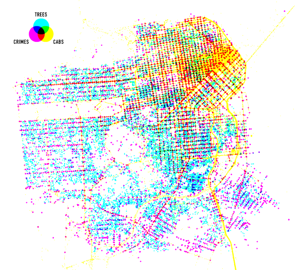
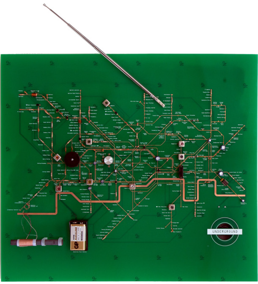
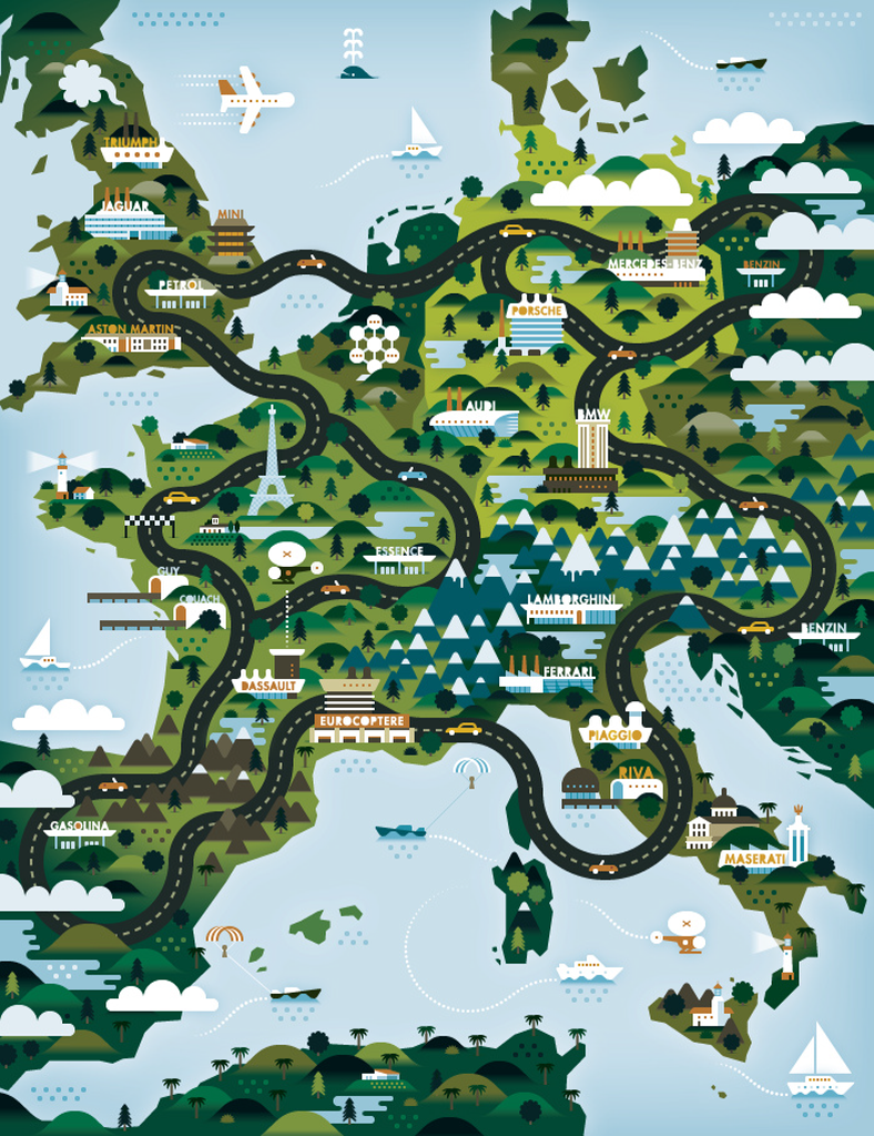
Knowing many of the individuals, the art does in fact do a good job of reflecting character. The descriptions make sense if you know a little of the background of the people and go a long way to explaining different cartographer’s take on…cartography. The way we make maps is a function of many things but there’s something very personal we all put into our maps…they reflect our own artistic and aesthetic abilities whether subconsciously or not.

You can view more Cartographer’s Handscapes at Dorrer’s web site here.

MapCarte 185/365: Mt. Hood by Kelly Abplanalp, 2013

MapCarte185_hood


Hachuring has been a very successful technique for the depiction of relief over the centuries yet it suffers from the problem that it requires a lot of space on the map. It can have the effect of causing visual clutter and a very dark image despite it’s excellent relief portrayal.

If you base your entire map on a modified hachure then you will really limit your space for any other detail but this can result  in some surprising results. Kelly Abplanalp has used a heavy hachure effect with large strokes for her map of Mt Hood. The subject lends itself to the technique due to the overall shape and the variation in terrain across relatively short distances. There’s an almost feathered effect created by the different densities of stroke and the major terrain changes can be easily identified.

This is more art than a map though it creates a strong aesthetic and a very bold impression. It demonstrates how you can take a cartographic technique and explore its potential for artistic interpretation. The inset map is a nice touch, being designed using similar stroke patterns and a brevity of labelling and other contextual detail ensures the main map image is clear and visually imposing. The red linework adds a pleasing contrast and accent colour.


MapCarte 182/365: Reliefkarte der Centralschweiz by Xaver Imfeld, 1887

MapCarte182_imfeld2

Throughout cartographic history there have been a number of eminent artists, map-makers and illustrators who have brought beauty and precision to the depiction of relief. We can trace relief depiction back to the very earliest maps when illustrations of mountains in aspect were etched into clay tablets. Since, many different techniques have been used including panoramas, oblique illustration, hachures and contours.

At first sight this beautifl map by Imfeld appears to be just another planimetric map with well executed hill shading but looking closer, it uses an intriguing additional approach. Rather than viewing mountains in an orthographic perspective, Imfeld has re-positioned the viewing angle to create a parallel orthographic view. This has the effect of showing the mountains partially in aspect which accentuates their form while not obscuring too much detail.

MapCarte182_imfeld

Imfeld, from Switzerland, became famous for his cliff drawings and especially for two masterpieces: The “Reliefkarte der Centralschweiz” shown here and his map of the Mont Blanc area. He’s less recognised as the first to use a parallel orthographic projection which has seen many reinventions yet here it is, drawn by hand to a high degree of precision. His mastery of colour, tone and shading is spectacular. Though containing many labels, they merge into the map without becoming dominant.

A superb topographic map, ahead of its time in many ways but giving modern map-makers a great example of relief depiction that improves on the standard orthographic approach.