MapCarte 306/365: The Story Map of Scotland by Colortext Publications, 1935

MapCarte306_scotland
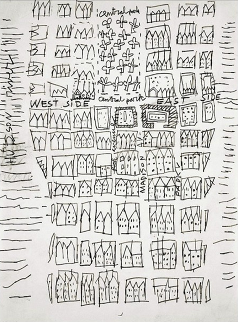
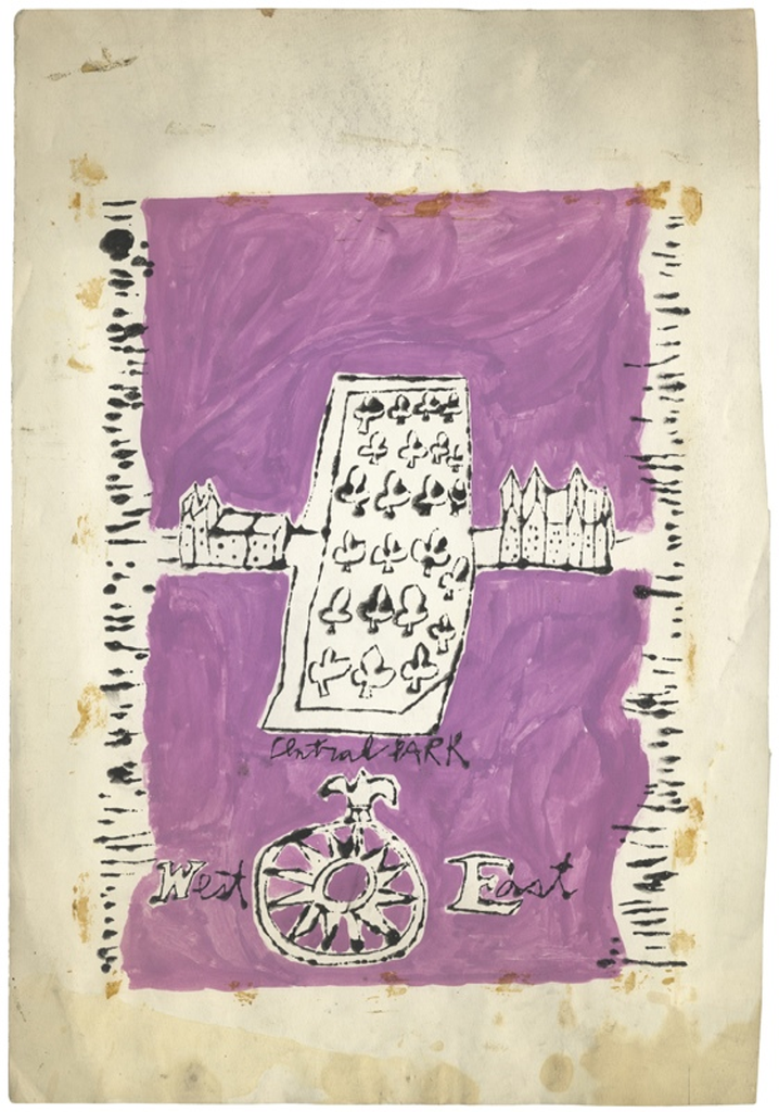
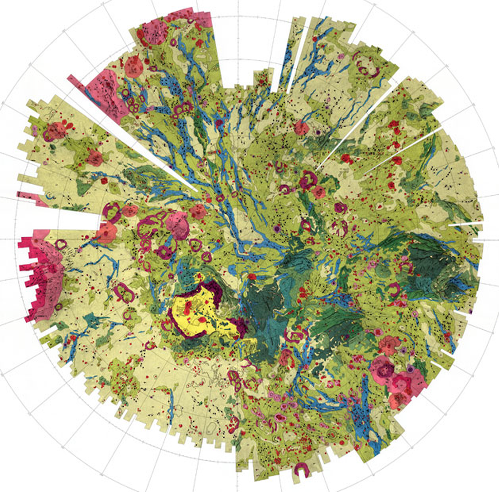
There’s a saying about things that are old become new again and we see plenty of that in cartography. In fact, many cartographic techniques seem to come in and out of fashion regularly as new map-makers find the technique or try and work out ways of creating a particular map type using new software. A good example recently has been the use of tesselated hexagons as a container for summarizing another dataset. We might call it hex-binning and for the last few years it’s become a popular way of mapping thematic point data because it creates visually and cognitively equivalent areas and which overcomes the death by push-pin red dot fever mapping.

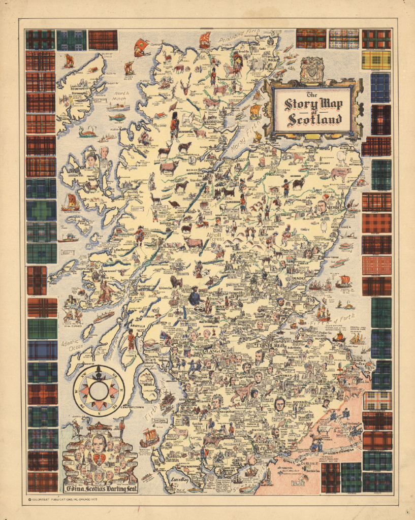
Another trend has been the use of new terminology to describe a particular type of map. To some of us a little older in the tooth a map is a map. We’d go so far as to categorize based on type (topographic, thematic for example) or scale (small, medium, multiscale) but the trend to create new brands and be seen as different is inevitable. A current fad is Map Stories or Story Maps. The idea that a map has a narrative and can tell a compelling story using a mixture of maps, graphics and textual components. As with most things, this idea isn’t new either. This map by the publishers Colortext was one of a series they labelled ‘Story Map’. It combines pictorial images, text and information that in this case tells the story of Scotland. It incorporates historical and cultural components in a place-based narrative.

MapCarte306_scotland_detail
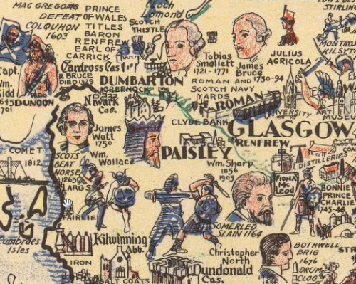
It’s possibly the first of the genre of Story Maps. Ernest Dudley Chase also produced a number of his own maps in the mid-1900s that he titled Story Map too. This is a well composed Story Map or, as some of us might say, a map. It’s pictorial elements are well composed and the map has a good density of information. The decorative border of the tartans adds further interest and the map as a whole combines several integrated themes to tell the story of Scotland.


MapCarte 294/365: NYC Street Maps by Andy Warhol, 1949 & 1954

MapCarte294_warhol1

Mapping is not just for cartographers. Many of the very best maps have been made by people that have little formal education in cartography or, even, many examples to their name. What they achieve is the ability to bring a fresh perspective to a specific theme and a perfect storm provides the conditions in which their map is produced. Of course, this is the exception rather than the rule and a cartographer will likely hit the mark more often than a non-cartographer. If we’re looking for design ideas and cues in mapping that helps us see the world in a different way then perhaps looking at purely artistic endeavor is one way we can imbue a more artistic temperament in our work. We explored one example in MapCarte 3 with ‘Map’ by Jasper Johns.

Here, we show perhaps pop art’s greatest exponent experimenting with the map. Andy Warhol, perhaps best known for his self portraits, bananas, Campbell’s soup cans and pictures of celebrities turned his attention to the map in these two works, both of Central Park, New York in 1949 and 1954. Like most art, it’s really up to the viewer to interpret them as he or she wishes. In many ways they are whimsical, almost incidental works that might have taken very little time to draw and paint. But their beauty lies in their simplicity.

MapCarte294_warhol2While slightly different in style and method, both maps contain simple shared characteristics. Both focus on Central Park. Both contain a clarification of east and west, one as labels across the map, one as a compass rose. Both contain simple representations of some streets; stylized buildings simply to represent existence rather than form; and the rivers are symbolized to border Manhattan island. They each contain the very basics of what a map is…scale, orientation, context, symbols and a focus.

The more you study these examples the more you see…the lack of a line to represent the coast, the use of colour to demarcate land, the systematic tree symbols, the orientation of some of the buildings in aspect to align with the road, and the isometric buildings in the later example.

Despite the apparent simplicity of the work, there are many cues Warhol has taken from more traditional maps. He’s woven them into art that represents the map but which allows us to see how the map itself can be deconstructed.


MapCarte 285/365: Lake Wakatipu by Simon Bardsley, 2014

MapCarte285_bardsley

Terrain representation is vital to good topographic cartography. It goes a long way to defining the look and feel of a map and has become a subset of cartographic expertise and practice that has defined many cartographers and their research interests and products. Classic terrain representation has long been associated with artists who were able to marry a keen eye for terrain with a well honed artistic ability. We might look at the work of Eduard Imhof as perhaps the finest exponent of hill shading for instance (See MapCarte 58). Many of the very best techniques began their life as manual techniques for which others have experimented with analytical versions. It’s debatable whether analytical techniques retain the elegance and beauty of manual techniques but they are sufficiently developed for map-makers to now be taking their experiments further.

In this example, Simon Bardsley has gone beyond default hillshade techniques to use a multidirectional model which captures the terrain in a stylized way. The shading almost represents contouring and might be seen as terracing if shown using traditional colours (or merely darker on the non-illuminated South-East slopes). Yet he’s used a range of pink and orange hues to subtley shade the hillshade and create a different aesthatic altogether. Bardsley describes the effect he was attempting to convey as a sunrise over the mountains. Certainly, the rich colours give that impression but it perhaps goes further.

MapCarte285_bardsley_detailWhether these are the actual colours one might see is perhaps questionable but it’s the impression evoked. It’s how we relate the palette we see in the real world and mentally merge it with the detailed hillshade. The map is abstract in real terms yet we are able to imagine the mountains at sunrise through the lens Bardsley paints. There’s even some hydrographic detail picked out using the technique which, of course, wouldn’t necessarily look that way in reality but leads us to imagine shimmering, reflecting light as it casts across the surface.

Terrain experimentation often leads to unexpected results. Bardsley illustrates that you can do interesting things with hillshading and analytical terrain representation and we get a beautiful map as a result.


MapCarte 277/365: British Isles Button Map by Hello Geronimo, 2010

MapCarte277_buttons

Purely a piece of art. The sort of item one only comes across in a small independent store and often unique. This fantastic piece of work by Hello Geronimo takes the map and makes something bespoke by making a collage of badges. Of course, anyone could do this but as with most art…not everyone does. Someone does. And what makes this work just that little bit more nuanced and interesting is the attention to detail. While the badges may appear to be a random collection, they are very carefully placed even though each piece is made to order and will be different.

In this example, for instance, there’s a life guard badge for Cornish beaches, a curry badge for Birmingham (the curry capital of England) and the inevitable shamrock, Guinness and wet weather symbology for parts of Ireland…and yes, the Guinness badge is located on Dublin. Take a look at a different map and we see a London Underground map in London, a Beatles badge in Liverpool and an “I caught crabs in Cromer”.MapCarte277_buttons_detailSimple idea. Elegant and considered execution. Wonderful piece of map art.

MapCarte 270/365: A hand drawn map of Toulouse by Karl Azémar, 2014

MapCarte270_toulouse

Click the image to view web map

There’s a growing trend in contemporary cartography that is supporting the ability for easy and rapid re-styling of OpenStreetMap data. It’s a mapping equivalent of paint by numbers and we’ve featured one or two on MapCarte (e.g. Stamen’s Watercolor in MapCarte108 or Space Station Earth by Eleanor Lutz MapCarte 236). How long the current interest can sustain cartography is questionable because ultimately it’s someone else’s base data and the only outcome is a map of basic topographic detail, styled in a particular way. What purpose infinitely re-styled maps has is still open to question though they are giving people the ability to stretch their digital creative juices.

This example by Karl Azémar goes a step further than most as he creates a framework for the map by making it appear in a window with a border that suggests an draughtsman’s drawing table. The sliding ruler is a nice touch as it also holds the controls for zooming. The legend and credits panel is moveable and the map is well drawn…literally. The hand drawn pencil and coloured pencil effect is well developed using different line treatments and shaded fills akin to the sort of map one used to create in a geography workbook.

What lifts this map above similar pencil styled maps is the way Azémar has considered not only the layout of the entire map window but also the content that includes a treatment for the names using Post-It notes. It’s a good way to handle labels on this sort of map and he even uses different colours to denote different categories of city. There’s a lot of good cartographic hierarchy in this map.

You can read more about how the map was made here.

MapCarte 255/365: Lifecycle by Thomas Yang (100 Copies), 2014

MapCarte255_lifecycle3

Maps are widely used as a basis for purely artistic endeavor. In this example, Thomas Yang has created a series of maps that are made out of bicycle components and then photographed. The components selected are used to denote the sort of features you’d see on a map – roads, buildings and physical features. His ability to make the map appear entirely plausible is down to the careful selection of the components that mimic different line weights and shapes, none of which would look out of place on a real map.

MapCarte255_lifecycle2

The planimetric map actually looks like a real map from a distance and you only see the components close up. The panoramic view makes excellent use of chain to represent contours, with cities rising above the landscape. Finally, the aspect of a cityscape is perhaps the least map-like but a beautiful image nevertheless.

MapCarte255_lifecycle1

A simple idea, well executed and which borrows heavily from the artistry of maps to provide a basis for a new art form. More details on the 100 Copies web site here.

MapCarte 250/365: American Golf by Sports Illustrated, 1990

MapCarte250_golf


There’s something uniquely compelling about the shapes that maps make. The outlines of countries, in particular, are one-off. They are instantly recognisable and allow artists and illustrators, as well as cartographers, a rich seam to exploit. There’s arguably no better way of representing something than combining a theme with a map shape.

Take this fantastic example from Sports Illustrated in 1990. The illustration is a wonderful use of the shape of the United States used as a golf green. The surrounding water hazards are depicted in a rich blue, the greens are lush and the ‘rough’ in Canada and Mexico frames the green perfectly. Even the Great Lakes are turned into a series of bunkers.

The illustration was commissioned to accompany an article about the massive growth in interest in golf at the time. The use of the map emphasises the point, making us see the spread of golf as nationwide. Whether the intent was to provide a strong message or not, the illustration shows us the extent to which map shapes can be used artistically.

MapCarte 246/365: Oblique map of Yosemite National Park by Tau Rho Alpha, N. King Huber and Clyde Wahrhaftig, 1986

MapCarte246_yosemite


The ability for modern web browsers to portray our world in three dimensions is perhaps now taken for granted. We’re able to pan, tilt and fly around Google Earth and other applications and see the terrain draped with all sorts of imagery and map layers. 3D has not always been so easy to portray. Traditional terrain representations such as hill-shading and contours are staple techniques but tilting the map until very recently meant creating a block diagram.

This block diagram of Yosemite National Park illustrates the technique with the map tilted to an oblique view. This would normally create a foreshortened image due to the perspective view but many block diagrams, instead, use an isometric projection so that scale is maintained across the image.

Of course, to construct these maps without the assistance of a computer, one requires a heavy artistic touch. This map is painted beautifully. It also makes use of the sides of the block, as if the map is extracted from the earth, to provide additional information. Other diagrams add to the overall display which creates a compelling view of the valley and the park.

MapCarte246_yosemite_detail

Isometric block diagrams bring a certain scientific aesthetic to cartography yet they have traditionally been prepared by hand using techniques from some of the very best landscape artists such as Erwin Raisz.

A full version of the map can be downloaded from the David Rumsey Map Collection here.


MapCarte 245/365: Florida Wildlife Corridor by Mike Reagan, 2013

MapCarte245_florida


The general mode of production for maps these days requires a mastery of the computer. Whether you use proprietary software through a Graphical User Interface, or code your map from scratch the basic toolset is one of mastery of a computer. Of course, technology in cartography has always changed and the experts of the tools of the time always rise to become the cartographers of the time. This was the same when it was copperplate engravers, drawing pens, scribing tools as it is today with computer scientists. When we see maps constructed differently they often stand out. It’s also the case that if they are made by someone with a mastery of their specific tools they stand out all the more.

And so it is with Mike Reagan’ map of the Florida Wildlife Corridor, painted in watercolour. There’s a certain human element that one might argue is missing from many maps where our own skills are mediated by algorithms and a computer’s precision but when painted, the artist’s skill becomes visible to all. The landscape is painted in shades of beige and greens and reflects land use types with a consistency of colour hard to achieve by hand. The map is also hand-lettered but again, consistency is upheld which gives the map a sense of uniformity and structure. These aren’t random marks; they’re carefully crafted; each one resulting from a decision.

Paintings evoke emotions because we see them as art. Painted maps can do the same.

MapCarte 242/365: Geomorphic/Geologic map of part of the northern hemisphere of Venus by USGS, 1989

MapCarte242_venus

Given some of the difficulties we seem to have in mapping our own planet, it’s a surprise that we are even able to make maps of other planets in the Solar System. But planetary cartography is a vibrant and thriving activity for many scientists and map-makers. The maps derived from telescopic survey or from radar, ground rovers, deep space craft and satellites gives the planetary cartographer data from which to make their maps. Such maps are normally of the topography or geology.

Venus is the closest planet to Earth but it’s still 162 million miles away. Put another way it’s about the same distance as 50,000 journeys from London to New York.. It’s amazing we can even make a map but not only that, they are beautiful.

Because the maps are predominantly dealing with geology and surface characterisitcs the maps tend to take on the style of a typically earthly geologic map yet the colours vary. they are richer, more saturated and – perhaps a little more un-earthly! Many maps of other planets are simply beautiful abstract works of art. This example is of the northern hemisphere of Venus by USGS using data predominantly from the Russian Venera 15 and 16 orbiters. Colours correspond to discrete features like volcanoes (reds/pinks) and plains (yellows/greens).

Artistic cartography but some of the most scientifically derived. Large versions of this map can be seen on the USGS web site here. Many more can be seen on the Lunar and Planetary Institute web site here.