MapCarte 66/365: Perpetual Ocean by NASA, 2012

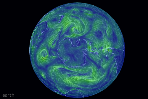
Tens of thousands of swirling ocean currents were captured and presented by NASA’s Goddard Space Flight Center in this animated map that creates a cinematic cartographic experience.  These are surface currents that cover the period June 2005 to December 2007; the result of physical observation and modelling.

The simplicity of the final map belies the complexity and computing power required to generate the results but rather than creating a detailed and complex graphic to expose how much effort and work went into the map, the work is left to shine and to amaze the viewer.

NASA themselves describe the results as creating a ‘visceral experience’. Indeed, if cartography is about connecting and generating an emotional response then they succeeded. One of the rare animated maps that uses a soundtrack to good effect.

Numerous versions of the animation can be found on NASA’s web site here.

MapCarte 25/365: In Flight by Kiln, 2014

MapCarte25_kiln

Click image to view the online web map

The first map of 2014 to be added to MapCarte is an impressive effort by Kiln, who have designed a multimedia app that celebrates 100 years of aviation history. Designed for The Guardian, the app shows how a story can be told through expertly integrating pictures, audio, commentary and animation with the map as a central character. The map holds the story together, providing a focal point that the story returns to at different points. The map itself is simple in design and allows you to explore historic flight data as well as real time patterns.

The background map is tastefully presented and the animated flight lines work well (with a nod to a number of other web maps that illustrate flow). The pace of the presentation is crucial and allows people an immersive experience. Controls are obvious and support, rather than interfere, with its use. Functionally, the app gives the user variation and holds the attention well. The commentary means that the map is supported by a story we can follow.

MapCarte 23/365: Earth Wind Map by Cameron Beccario, 2013

MapCarte23_Beccario

Click image to view the online web map

Building upon the original wind map concept, Cameron Beccario has expanded the scope to a global scale.  The near real-time map offers a range of data views including wind, mean sea level pressure and temperature. The animated flowlines are coded using ‘industry standard’ colour schemes (though some are subject to long debates about their effectiveness). The map is mesmerising but really comes into its own with simple and intuitive controls to vary a wide range of parameters. You can modify the height of the wind layers you’re viewing, the time (to explore historical conditions) and also the projection. This provides a fascinating way to morph the global view into different shapes that reveal alternative patterns visible in the data. Controls are hidden from the main view to reduce clutter and Beccario includes full references and discussion of the product. A work of art and a strong aesthetic built upon solid cartography.

MapCarte 8/365: The Next Big Spill by Lauri Vanhala, 2013

Beautiful production on this video of marine traffic in The Baltic Sea gives the map a cinematic quality. The map is the main actor but the supporting cast of captions makes it easy to understand. The map provokes a questioning approach to what you’re seeing as the story unfolds. The zooming, panning and soft-focus gives the map a strong aesthetic and the use of a sensible soundscape adds to the atmosphere.

This map goes beyond simply animating data and expecting the viewer to figure out what’s going on. It asks a question in the title, builds expectation with a series of statements before the map is revealed. A sensible use of satellite imagery to provide the basemap and because of the dark background, highly saturated colour is used to great effect for emphasising the marine traffic colour coded by type.

it would have been easy to speed up the animation like so many online maps of temporal data but the slow speed adds to the overall impact.