MapCarte 242/365: Geomorphic/Geologic map of part of the northern hemisphere of Venus by USGS, 1989

MapCarte242_venus

Given some of the difficulties we seem to have in mapping our own planet, it’s a surprise that we are even able to make maps of other planets in the Solar System. But planetary cartography is a vibrant and thriving activity for many scientists and map-makers. The maps derived from telescopic survey or from radar, ground rovers, deep space craft and satellites gives the planetary cartographer data from which to make their maps. Such maps are normally of the topography or geology.

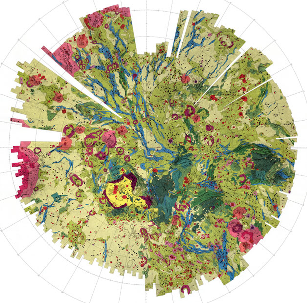
Venus is the closest planet to Earth but it’s still 162 million miles away. Put another way it’s about the same distance as 50,000 journeys from London to New York.. It’s amazing we can even make a map but not only that, they are beautiful.

Because the maps are predominantly dealing with geology and surface characterisitcs the maps tend to take on the style of a typically earthly geologic map yet the colours vary. they are richer, more saturated and – perhaps a little more un-earthly! Many maps of other planets are simply beautiful abstract works of art. This example is of the northern hemisphere of Venus by USGS using data predominantly from the Russian Venera 15 and 16 orbiters. Colours correspond to discrete features like volcanoes (reds/pinks) and plains (yellows/greens).

Artistic cartography but some of the most scientifically derived. Large versions of this map can be seen on the USGS web site here. Many more can be seen on the Lunar and Planetary Institute web site here.

MapCarte 225/365: Is Barack Obama President? By The Guardian, 2012

MapCarte225_president

Infographics are all the rage. In fact, maps have always been information graphics. Sometimes, though, maps and mapping ideas can be used in extremely innovative ways to help create what might be termed a modern infographic.

Take this illustration from The Guardian’s coverage of the 2012 Presidential election. It has the two candidates holding a handful of balloons. At first glance there’s very little map-like about this infographic but the balloons are, in fact, a Dorling cartogram. Each balloon represents a US state, coloured to show strength of vote, with the shared States being held by both candidates in the middle and the more partisan States being held well away from their opponent.

Each balloon is a perfect proportional circle and hovering over the balloon reveals further details.

MapCarte225_president_detail


The combination of illustration and the use of a statistical and highly abstract map form is a great way to present data in a new and interesting way and perfect for journalistic purposes.

The approach is supported by a clean look, effective typography and bold numbers to clearly inform the key facts. The balloons float into the screen and reorganise just as if filled with helium (or a metaphor for hot air perhaps?). There’s very little visual clutter on the page.

Take a look at the interactive version of the Obama map here or, for the sake of being equal, the Romney version here.

MapCarte 219/365: Kara’s Wave by Matthew Cusick, 2009

MapCarte219_cusick


No list of aesthetically pleasing maps would be complete if every once in a while we didn’t delve into the purely artistic form. Maps are, after all, beautiful objects in their own right and ignoring their possible function as tools for communication they perform a function as a piece of visual art. This is the reason why many people hang maps on their walls, even paper their walls with maps or collect map-related objects.

Matthew Cusick approaches maps as part of a palette of colour, shade, texture and meaning which he weaves onto the canvas along with acrylic paint. Rather than simply using just paint, he uses pieces of maps from which he creates a collage to bring to life an artistic work. Kara’s wave makes considerable use of topographic maps and bathymetric charts. He has built a picture of the wave using maps and at a distance it appears no different to any other painting. Placement of the maps is not accidental or random. The shapes of the pieces gives shape to the overall piece and we can see the swirling mass of water take shape. Textual components follow the same lines and ingeniously, a polar azimuthal projection of Antarctica is used as the fulcrum of the crashing wave…the circular shape adding to the motion and the white landmass suggesting the foamy wash.

Maps as art give them a new life perhaps when their original purpose has waned. They certainly give artists a rich medium with which to work. Cusick has many other examples such as an image of a car…made predominantly of street maps which blends the map type perfectly with the picture’s theme once again. Many more of his works can be seen on his web site here.

MapCarte 217/365: Apollo 11 traverse on a football pitch by Joe O’Dea and Thomas Schwagmeier, 2005

MapCarte217_apollo


Comparisons are extremely important for visual communication. Without comparisons we have no baseline about which we can make some sort of decision. When maps are involved, we often see areas that exhibit more, or less…or have values that are higher or lower. We sometimes use multiple maps to display how patterns have changed over time. There’s many techniques but the fundamental principle involves giving your map reader a basis for comparison to support their ability to assess what they are looking at relative to something else. Making the ‘something else’ familiar or understandable is crucial.

So if you were mapping the geography of the first moon landings by Neil Armstrong and Buzz Aldrin how do you give your reader a comparison given no-one, by definition, would ever (or are very unlikely ever) to have seen the place. The answer is to give them something that is familiar. The map presented here plots the various activities of the moon landing faithfully. It uses simple geometries that in themselves are understandable. Presenting the work atop a football pitch with its universally familiar markings is a clever approach. immediately, we have a sense of scale and extent. The football pitch is arguably the most internationally of sports and translates well with no other language or description necessary. The fact they gave it a strong colour and made it integral to the work also benefits the map. They could have used a faded outline but for comparison we need a strong visual.

An excellent use of a comparative symbol and extent to support the main map reading task.

MapCarte 212/365: LA-NYC by Minh Anh Vo and Victor Schuft, 2010

MapCarte212_papercut

Quite often you can reduce the complexity of a phenomena to be mapped right down to basic principles. Elimination of detail is a key concept in cartography and often we’re too afraid to remove content. Take a road trip though…really it’s just a single line and some means of saying something about the journey.

A road trip by designers Minh Anh Vo and Victor Schuft turned into a beautiful abstract linear map. Using a timeline as a guiding principle they use simple colours to differentiate days, marker flags, places and mileage. It almost looks like a kite flying across a page.

MapCarte212_papercut_detail1

Flags mark where State boundaries were crossed. Red and black blocks of colour on the timeline alternate to differentiate days. A geographically accurate line above the main diagram shows the real route. No other detail is necessary and what makes this map beautiful is the brilliant use of white space…plenty of it.

MapCarte212_papercut_detail2


It’s certainly at the abstract end of the cartographic spectrum but a very effective approach to the mapping of this journey.

MapCarte 211/365: Bauhaus building by Hinnerk Scheper, 1926

MapCarte211_Scheper

Mapping in the third-dimension is nothing new in cartography. The very earliest maps on clay tablets illustrated mountainscapes by using rudimentary aspect depictions. Perhaps we nowadays think of 3D as detailed cityscapes with photorealistic textures yet this isn’t always the best way to approach a solution for which 3D might be appropriate. One of the key tenets of cartography is, of course, generalization and so reducing complexity to the bare essentials sits at the heart of much of what we do. Detailed satellite base imagery and realistic building renderings are becoming a map-makers preferred approach and it’s inevitable people add stuff to a map if it’s available. Elimination is one of the most important skills a cartographer can master. This map, created by Bauhaus teacher Hinnerk Scheper illustrates the principle at work.

His map is a large scale representation of the orientation and outline plan of the various floors of the Bauhaus building in Dessau, Germany. Floors are shown one on top of another and colour signifies function. The linework is absolutely minimal. Colour is applied internally to each room but not as a complete fill. This gives the work space to breath and reduces the blocks of colour which may overpower the image due to the differently sized rooms. An almost whimsical set of linework connects the floors simply indicating staircases and the front and back of the building is represented with a slightly thicker line.

There’s no photorealistic textures. There are no transparent walls. There’s no need for any other landscape detail. It communicates the structure of the building and the function. that’s it. That’s all.

Of course, the Bauhaus style has had a profound influence on many aspects of design including architecture, interior design, typography and graphic design. We can learn much from such design approaches to inform our cartography.

MapCarte 202/365: Escape Routes by Torgeir Husevaag, 2010-11

MapCarte202_escaperoutes


MapCarte202_meetingpoints

Designed as an exhibition piece in 2011, Escape routes and it’s counter piece Meeting Points offer an artistic interpretation of paths of movement through an unnamed city. The reason for escaping is not made clear so the maps are esoteric and unexplained in terms of a clear purpose yet cartographically they create an interesting aesthetic.

The first map, Escape Routes, plots the paths of 32 directions around a compass rose from the centre of the city showing the different characteristics of the escape route through symbology. The paths are defined as: Up to an hour. Wintertime. Moving discreet, not getting noticed, not running, staying cool. No trespassing. Keeping outdoors, avoiding ski tracks, deep snow, thin ice. No parkour. Avoid trouble. Again, these are somewhat obscure but point to the way in which the paths have been classified. Two are picked out for special attention – the first that shows the farthest you can reach in an hour; the second the path most likely to put off anyone pursuing. The detail in the symbology of lines created with dots and other small geometric marks shows clear differentiation in type.

The second map, Meeting Points, shows through increasingly sized circles the various places that one could meet at different times along the one hour journey. Each circle acts as a lens through which the otherwise obscured street network is displayed. This effect guides the eye to only those parts of a complex street network relevant to the theme. It focuses attention and declutters the otherwise noisy image.

An artistic interpretation of map form and function that creates an interesting aesthetic with practical cues which more purposeful cartography might borrow.

More images (but not much more detail) on the artists web site here.

MapCarte 196/365: Trees, cabs and crime by Shawn Allen, 2009

MapCarte196_trees


Three colour print technology is based on the principles of the subtractive colour model whereby magenta, cyan and yellow pigments are combined to create pigments that absorb certain wavelenghts of light. We begin with a white background and mixing gives us a full palette of subtractive colours.

Why not use it to create a trivariate thematic map which illustrates the density and overlap of certain features as they occur in the environment. This map uses equally sized circle symbols representing three separate features in San Francisco. While they possibly cannot be said to correlate to one another in a causal sense we get a clear idea that trees signify a particular type of landscape, that cabs tend to concentrate in the north east and the downtown area and that crimes occur throughout. Interestingly, the mixing of the subtractive colours gives us reds, blues and greens showing the predominance of two of the variables…and occasionally some black showing the presence of all three in close proximity.

Crime tends to appear on east-west streets rather than north-south but the main outcome of the map is to see the city through a different lens through subtractive blending.

A neat reworking of a well established technique that creates a visually interesting map and one which perhaps has further utility.

A web map version can be seen here.

Ed notes…details here.

MapCarte 191/365: European car manufacturers by KHUAN+KTRON, c.2010

MapCarte191_khuan

Illustrative maps are always good value in magazines and for poster designs. Many tend towards the abstract as a way of capturing attention and graphic design studio KHUAN+KTRON are known for their characteristic colourful illustrations for magazines such as The Good Life, Wired and Monocle.

Their work tends to be playful and somewhat eccentric in style and in many respects their work mimics more general pop culture references. This is nowhere more in evidence than in their series of maps which have become a signature style. Produced for a range of clients, they combine a cartoon-like aesthetic with a good dose of humour.

This example, produced for The Good Life magazine to accompany an article on the European Car Manufacturing industry is an excellent example of their maps. Bright, colourful in a limited palette and with an abstract pictorial representation of trees, mountains, landscapes, buildings and, crucially, the factories of the car manufacturers themselves.

Proving that a potentially dull subject matter can be turned into a beautiful map, KHUAN+KTRON have created a unique and vivid set of maps.

More maps in a similar style can be seen on their web site here.

MapCarte 190/365: Cartographer’s Handscapes by Angela Dorrer, 2013

MapCarte190_dorrer1

The convergence of art and cartography is perhaps never more abstract than in the hands of an artist using the hands of cartographers as her canvas. Angela Dorrer’s handscapes are constructed with no preparation or pre-defined ideas about how the work will develop, what appearance it takes or what it may represent. It’s spontaneous art using maps as a medium to explore people and attempt to reflect something of them in the work.

As Dorrer explains “In every hand there are elevations, valleys, paths, branches and patterns”. Out of this, she develops topographies and new cartographies by painting directly onto the palm: handscapes. Through painting she discovers and/or uncovers, what she refers to as a new country. She explores, she measures, she maps a terrain, she names and every aesthetic decision has cultural consequences. However the existence of the new country and this new painting is short term, as the host body will begin to break it down rapidly with bodily sweat.

During the International Cartographic Conference in Dresden, 2013, Dorrer painted handscapes on a range of cartographers. As she painted, the two people spoke and she interpreted the conversation into her map art. Once complete and a photograph taken, the cartographer was invited to provide a written interpretation of their handscape. The results are intriguing.

MapCarte190_dorrer2
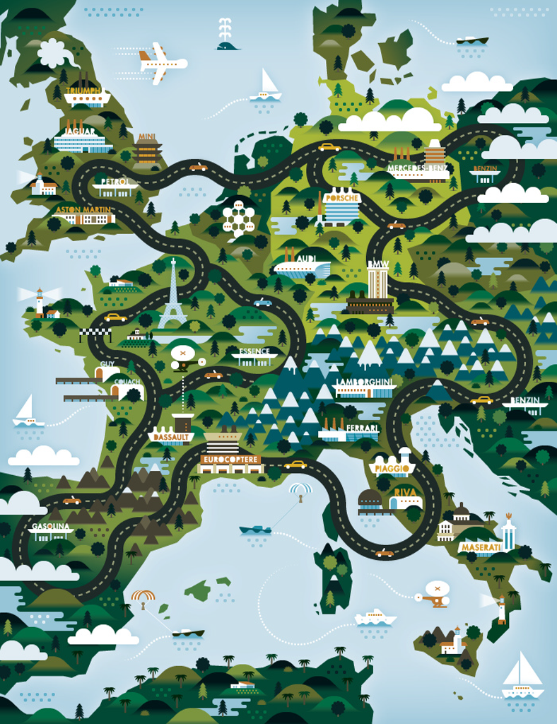
Knowing many of the individuals, the art does in fact do a good job of reflecting character. The descriptions make sense if you know a little of the background of the people and go a long way to explaining different cartographer’s take on…cartography. The way we make maps is a function of many things but there’s something very personal we all put into our maps…they reflect our own artistic and aesthetic abilities whether subconsciously or not.

You can view more Cartographer’s Handscapes at Dorrer’s web site here.