MapCarte 361/365: Trajectory wall by Christian Tominski et al., 2012

MapCarte361_trajectory
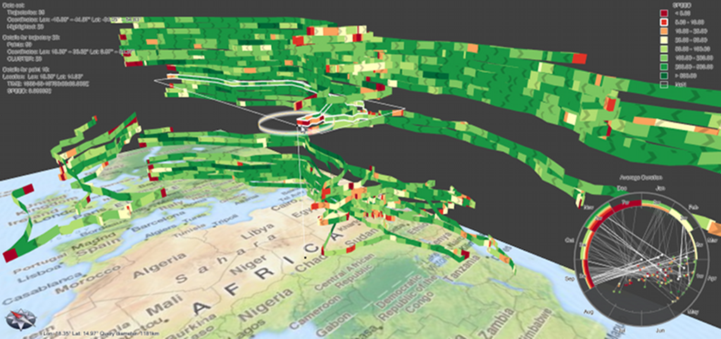
Compexity is often inherent in data but difficult to tease out in a meaningful way when we try and represent it visually. One of the key design tenets for cartography is selection and omission and this is often done to simplify the mapped phenomena to bring some salient characteristics into view. It’s not always an appropriate approach because complexity may very well be the very aspect you wish to convey…but that doesn’t mean that you don’t also want readers to be able to make sense of what it is that’s being mapped. The search for alternative forms of visualization is almost a discrete type of cartography in itself. Beginning with data and a desire to find an appropriate form with which to map it is important for cartographic research and in design terms gives us new ways to represent data. Here, Tominski et al propose a new form of visualization they term a trajectory wall that demonstrates the art perfectly.

Mapping trajectories has always caused difficulties for cartographic representation. The data by its very form requires the mapping of both spatial and temporal information as well as some attribute which can, of course, vary both spatially and temporally. Attempts to resolve some of these visualization issues have been made before but this is the first real solution to accommodating all components in a single approach. The core approach is a stacked representation in a hybrid 2D/3D display. The 2D base gives spatial context while trajectories are stacked in 3D space with attributes encoded through colour. The temporal aspect is encoded through the order of the stacked trajectories as well as a linked graphical time display.

MapCarte361_trajectory2
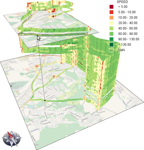
The approach is a development of the space-time cube by Torsten Hagerstrand and which has subsequently found a re-birth with the onset of 3D enabled Web GL browsers that genuinely bring interactivity to the toolbox of the cartographer in a new way. The ability to use 3D and to provide full interaction overcomes many of the limitations of static displays that have hindred proper 3D cartography. Tominski illustrates how we can develop such graphical approaches to make visual sense of complex data. Of course, full interaction and query also gives the user additional ways of exploring the data through visualization.

You can read more about the technique here.

MapCarte 248/365: In the shadow of foreclosures by the New York Times, 2008

MapCarte248_foreclosures

Very few newspapers have a team dedicated to data visualization and information design. Many produce data dumps that are the antithesis of design.  The New York Times, however, creates consistently high quality maps and graphics to tell their stories.

Small Labs Inc provide an excellent repository of over 300 superb examples of their work to date which are a catalogue of best practice in thematic map design – viewable here.  It’s almost invidious to select one example of their work that sits above all others but we’re going to try…

The map of foreclosures from 2008 displays multiple variables in a striking 3D graphic giving the map the look of buildings on a city landscape.  The map labels don’t dominate even though they add important contextual statistics.  Subtlety is the key here.  The fine san serif shape means it sits further in the background and doesn’t obstruct the foreclosure shapes.  The white US country background provides a neutral landscape for the buildings to emerge from.  Simple, thin, solid black lines delineate the state lines. The map page is complemented by two traditional but expertly constructed choropleths and the overall page maintains a clean fresh appearance with excellent visual balance.

We could point to the fact that the perspective 3D view makes measuring the building heights for comparison a little difficult but in the context of the readership and presentation it’s sometimes perfectly reasonable to break a few cartographic rules. A great example of data journalism that uses cartography to good effect and with purpose.

MapCarte 149/365: Mt Everest in 3D by 3D RealityMaps, 2011

MapCarte149_everest

For cartographic purists there’s very little that matches a beautiful planimetric topographic map of a region. In many respects these are the maps that define the art and science of cartography because they are the standard-bearers for how we graphically describe the world around us. Those that are capable of crafting a beautiful topographic map have given us some wonderful, rich, detailed and beautiful examples. Often, the most visually impressive are of mountainous areas which demand that cartographers tackle the issue of elevation and relief. This is an art form in its own right.

However, new technologies afford us different ways to view the world and in many of these remote, often highly dangerous, areas different approaches to data capture and map design are giving us new maps and new ways of seeing. Here, 3D RealityMaps have flown small planes over Mount Everest and filmed the landscape using a 3D camera. The captured footage allows researchers to build a 3D computerised model of Everest to 15cm resolution which can then be viewed through a downloadable app.

The model can be downloaded to explore allowing you to wander around Everest and follow many of the famous climbing routes, base camps and weather stations. The images are crisp and clear and have been expertly stiched together to create a seamless model of the mountain and its surroundings. The project also makes good use of satellite derived data to build a range of different components in the final map including WorldView-2, RapidEye, Landsat and ASTER. Some of this data was combined to provide surrounding coverage or to build a detailed terrain model to drape the primary imagery. Labels and annotated routes add to the detail of the work and enable the user to retrieve context to go with the pretty pictures. Photorealistic quality models and unrestricted navigation through a mountain region is made possible through the app.

This is modern surveying used to create a modern, engaging product. It’s a far cry to ground survey and planimetric mapping but it provides us with a way of looking at such a place that a traditional topographic map cannot similarly achieve. That’s not to say it top trumps topographic maps. It’s different. It adds to the canon of cartography.

You can explore and download the app at 3D RealityMaps here.

MapCarte 92/365: Reshaping New York by The New York Times, 2013

MapCarte92_newyorktimes

Click the image to view the online map

As part of a special series of articles exploring the mayoral legacy of Michael Bloomberg, The New York Times presented a map-based application that told the story of some of his more notable achievements and impact on the city of New York. Telling a story through maps isn’t novel but telling it through a responsive digital environment with clean, crisp graphics, a minimum of words and a narrative that allows the user to explore is an achievement. The New York Times are contemporary masters of digital map-based story-telling.

The application takes the form of a linear tour, opening with a clear statement ‘from buildings to bike lanes to painting over Broadway, how the city changed in 12 years of Bloomberg’. There’s a ‘begin tour’ button yet it doesn’t actually matter where you click to advance the story to the next page. This is a clever trick…no need for people to have to worry about hitting a particular point on the page…the page turns wherever you touch it…much like you can turn the page of a book pretty much anywhere on the page.

The maps include 3D renderings of the city’s buildings….simple grey blocks rather than detailed facades work because the skyline is uniquely familiar. Key buildings in the story are picked out in red – the only other hue used as a focal colour and there are subtle shadows and shading to add depth and structure to the image. It’s a nicely composed illustration with labels added with a semi-transparent knock-out mask as appropriate. Some clicks reveal (rapidly) an aerial photograph that contrasts well with the simple map rendering. These maintain the interest and help to illustrate the facts using real imagery that reinforces the reality. As you move through different topics, different colours are used to match different themes. Red for buildings. orange for rezoning, green for bike lanes. Three colours that we can easily recall when thinking about the topics in the story.

Between stories and scenes, the maps animate smoothly with an almost surreal fuzziness until they stop and come into focus. This is a great trick and allows us to pause while the map gets to where it’s going before the focus draws our attention back.