MapCarte 279/365: World Atlas of Wine by Littlehampton Book Services, 1971

MapCarte279_wine1

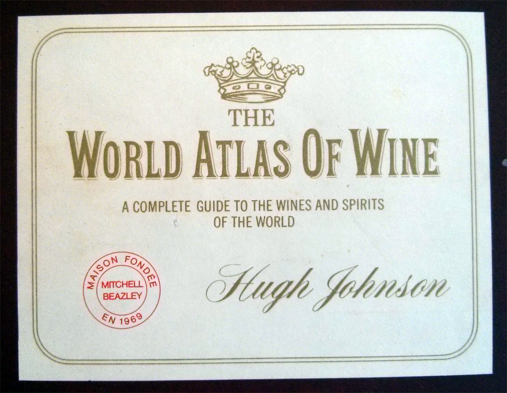
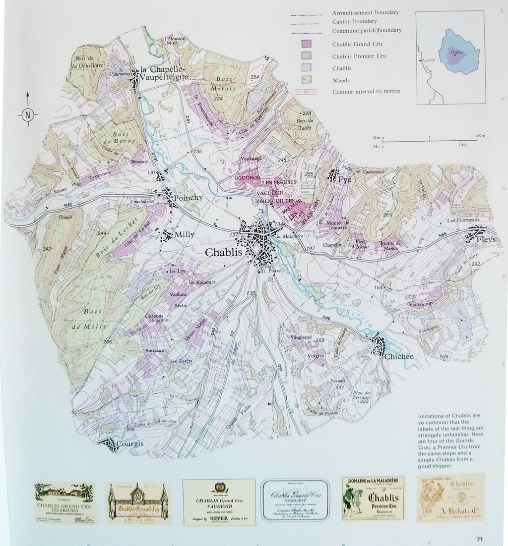
Hugh Johnson’s world alas of wine, publihed by Littlehampton Book Services is a magnificent example of thematic atlas cartography. The numerous pages explore the terroir in a way that had not previously been attempted in such detail. Each page explores the specific local geography of a region and the various wider geographies that impact the wine of that region. For instance, the page here showing Chablis, France, illustrates the topography and differentiates between Chablis, Chablis Premier Cru and Chablis Grand Cru through a pleasing colour scheme. The main map is placed in its regional context and the nice addition of different labels adds to the layout.

MapCarte279_wine2

The maps are simple yet beautiful works of art that explore the fields and vineyards of the different producers. They show clearly the topograpy as well as the local land ownership and production.

MapCarte279_wine3

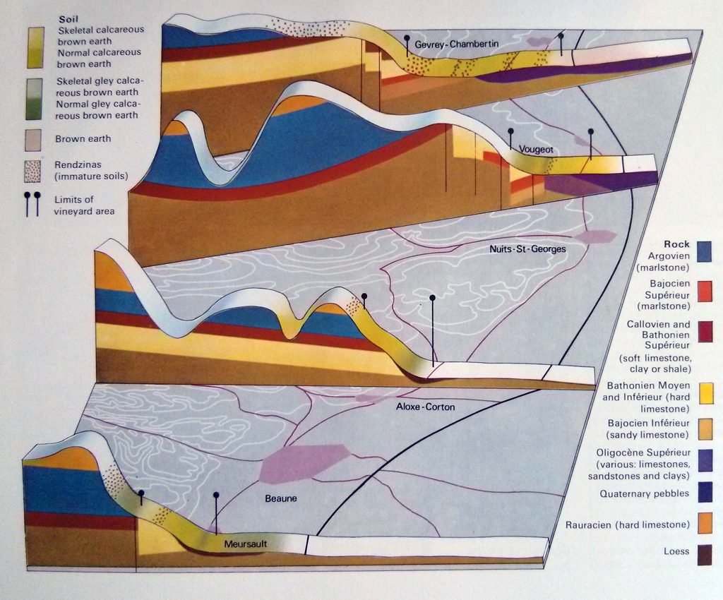
But the maps are not just topographic; a number explore the geography through 3D block diagrams and alternative representations which bring to life the geography of wine. The atlas is jam packed with maps of all parts of the world though the focus of this first edition is on he main European producers. Later editions give more prominence to the increasing contribution of new world winerys.

A perfect excuse to pour a glass of your favourite wine and then pour over a delightful atlas to explore its origins.

MapCarte 278/365: Socio-economic tectonics by Kenneth Field, 2014

MapCarte278_Field


Forgive the fact it’s one of mine but others feel it worthy of inclusion…

The standard way of illustrating socio-economic data for countries on a world map would be a choropleth. Options, of course, exist, to show data in a different way including proportional symbols or cartograms. All of these techniques are perfectly reasonable but all suffer from one problem, namely that it’s up to the map reader to make visual comparisons between areas shaded differently or symbolised differently. The focus is on how one place compares to another. What if the question is based on trying to understand how similar or dissimilar neighbours are?

This map looks specifically at the relationship between bordering countries to create a set of proportional line symbols that represent their dissimilarity…let’s call it a proportional adjacency map (any better ideas?). It’s a sort of linear cartogram.  Thinner lines mean countries share a very similar value for the variable. Thicker lines mean adjacent countries are very dissimilar. Additional ‘boundaries’ have been added to show how countries differ when they are separated by a stretch of sea or ocean.

MapCarte278_Field_detail


The map shows twenty key socio-economic indicators, four for each of five broad themes. The use of small multiples gives a sense of how different countries vary across different measures. The only colour used on the map simply provides a motif for each of the five themes. Additionally, there is a note for each variable to express which two adjacent countries are most similar, and which are most dissimilar. The title is simply designed to capture attention and provide a metaphor for the socio-economic fracture zones that crisscross the planet.

The style of the map has been deliberately kept subdued so only the coloured fracture zones stand out. It demonstrates that if we’re trying to map a specific characteristic of data that isn’t well supported by conventional techniques then sometimes we have to make a new technique or modify one to suit our purposes. In many ways this map tehnique is the counter to a choropleth and literally fills in the gaps.

You can download a full size print version of the map here.

MapCarte 277/365: British Isles Button Map by Hello Geronimo, 2010

MapCarte277_buttons

Purely a piece of art. The sort of item one only comes across in a small independent store and often unique. This fantastic piece of work by Hello Geronimo takes the map and makes something bespoke by making a collage of badges. Of course, anyone could do this but as with most art…not everyone does. Someone does. And what makes this work just that little bit more nuanced and interesting is the attention to detail. While the badges may appear to be a random collection, they are very carefully placed even though each piece is made to order and will be different.

In this example, for instance, there’s a life guard badge for Cornish beaches, a curry badge for Birmingham (the curry capital of England) and the inevitable shamrock, Guinness and wet weather symbology for parts of Ireland…and yes, the Guinness badge is located on Dublin. Take a look at a different map and we see a London Underground map in London, a Beatles badge in Liverpool and an “I caught crabs in Cromer”.MapCarte277_buttons_detailSimple idea. Elegant and considered execution. Wonderful piece of map art.

MapCarte 276/365: Medallandssandur by Torgeir Husevaag, 2010

MapCarte276_medallandssandur

Art and cartography can evolve in all manner of strange circumstances. Many cartographers will try and imbue their work with an artistic element. Many artists use cartographic works to create a piece of art. This example belongs to the latter category though in some respects it bridges the two.

MapCarte276_medallandssandur3

Torgeir Husevaag stumbled upon a series of old topographic maps during a stay in Iceland and bought them with an idea to make something of them. The map sheets were interesting because very little of the printed area had any land. They were predominantly sea and typical of a printed sheet system that inevitably leaves some sheets bereft of much detail.

MapCarte276_medallandssandur2

Husevaag’s artistic approach looked at the vast expanse of nothingness and attempted to fill in the gaps with invented phenomena. This, indeed, was an attempt to mirror the perpetual cartographic habit of filling gaps in maps with something, anything. He added a number of different features by drawing on the maps to show a representation of whale song using a sonar pulse, the juxtaposition of crop circles represented in blue in the sea, a pair of mating whales, and an impression of Iceland’s largest mountain depicted as contours in the ocean.

MapCarte276_medallandssandur1

This MapCarte is purely art but draws inspiration from past cartographies to generate new images and uses for the empty spaces on maps.

MapCarte 275/365: The population and the state capitals by Carlos Lemos, 2010

MapCarte275_brazil

Click image above to go to web map

The word infographic has become a part of the lexicon used to describe information delivered using graphics. Maps have always been information graphics and although this example is described as an infographic it’s actually a map; an abstract, interactive web map, but a map nevertheless. It deals with spatial information and organises it in a manner that assists the communication of the message the author wishes to impart.

Lemos shows the distribution of the population of municipalities in relation to the capital of each Brazilian state. It illustrates the urban hierarchy too in a clean, efficient graphical manner. It’s a cartogram that dispenses with the real geography in favour of a version that ignores everything except the crucial aspects…population sizes illustrated as proportional symbols, organised in a linear fashion, by state.

The map’s use is supported by a simple yet elegant functionality including data display returned via a hover rather than a click. You can zoom to disentangle the symbols giving clarity to each spoke of the map. Transparency is well used and gives a sense of density.

Simple. Effective. Enthralling and informative. Maps do not need to be graphically complex to impart their information but they do need to be engaging.

MapCarte 274/365: The Milford Track by Roger Smith/Geographx, 2014

MapCarte274_milford

Despite the almost incessant claims that print cartography is dead nothing could be farther from the truth. While we are seemingly inextricably linked to our digital mobile devices there’s something eternally useful about a paper map. The batteries never run out in the middle of nowhere. They suffer to a lesser degree in rain or bright sun. They can be crammed into your backpack…you can even damage them and not break the bank! That doesn’t mean that print cartography cannot develop.

In this example from Roger Smith, he applies his unique graphic approach to the creation of a series of maps designed to support planning as well as hill walking along some of New Zealand’s most famous and spectacular walks. Here we feature perhaps the most famous, the Milford Track, designed for outdoor use to support the need for navigation and information along the track.

MapCarte274_milford_detail

Smith uses a pseudo-natural looking base map which contains a lot of textures. The usual flat depiction of terrain (e.g. a solid green fill for forested areas) gives way to textures that mimic the environment. Here, he’s providing some sort of naturalistic look that falls short of the visual clutter associated with draped satellite imagery. The fills and textures are consistent and help to demarcate different vegetation types and the colours, browns and greens and rich and earthly.

The hill shading and attention to detail gives a dark, brooding appearance and helps give a sense of awe to the magnificent landscape. If ever a map evoked an environment then this is it. The Milford track itself is prominent and depicted in bright yellow (as in ‘follow the yellowbrick road’) that contrasts well with the background. The contours are also prominent and help to show how the track rises and falls with the topography. Typography is generally printed in light colours to contrast with the background and a hint of shadow is used to lift it which works better than the somewhat standard approach of using a halo.

Perhaps the most interesting aspect of the map is the design of the material. It’s printed not on paper, or even tyvek…but ona water-proof, insect-proof and tear-resistant product made of crushed mineral deposits. It’s printed on crushed rock and that means you can do pretty much anything to it and it’ll survive. You can’t do that on your iPad in the middle of a 4 day hike in the middle of nowhere.

MapCarte 273/365: Highways of the United States of America by Cameron Booth, 2014

MapCarte273_booth

One of the drawbacks of Harry Beck’s fine subway map (MapCarte 1) is that far too many map-makers and designers have relied upon it as a template for their own map. It’s perhaps stifled creativity when we may have seen the next ‘Beck’ emerge instead. Once in a while though, the Beck magic is actually put to good use and Cameron Booth’s one such graphic designer who has worked with the general formula but deployed it meaningfully (sidenote: Booth maintains the informative and detailed Transit Maps Tumblr too). Of course, Beck isn’t his only design cue.

MapCarte273_booth_detail1

Booth has designed a number of maps in the schematic style but here we highlight his Highway’s of the USA which is the result of a two-year effort to check and codify every current Interstate and Highway. The schematic approach works well but Booth is quite keen to point out that rather than it being seen as a subway map, it’s a simplified road map and that thinking allows us to break loose from the subway metaphor to an extent. The clarity of the map is supported by the simplified linework which uses clean distinguishable colours. Station circles are used for towns and cities that contain an intersection and ticks for places that fall along the road. Places are sized according to their importance in terms of the number of roads that intersect and there are nearly 4,500 place names on the map which given the white space is a monumental achievement in controlling the graphic hierarchy and overall balance of the work.

MapCarte273_booth_detail2

Route naming conventions are systematically applied and again contain a well developed hierarchy and overall the map is a harmonious work that while containing a strong nod to the subway genre makes use of the style and form to support a clear design requirement. The attention to detail is meticulous which illustrates the importance of ensuring every last element of your map is given due consideration. There’s good sense in the maxim that 90% of a map is produced in 10% of the time and the final 10% takes the remaining 90% of time. I don’t know, but I’d wager this sort of balance reflects Booth’s work on this map.

This isn’t just a map that takes a previous design and pours new data onto it. This is a fresh take on the genre and regardless of whatever subway maps have gone before, its form and function are perfectly articulated.

You can read more (and buy prints) about Booth’s map at his blog here.

MapCarte 272/365: London Galaxy by Charley Glynn, 2013

MapCarte272_galaxy

Sometimes the simplest of approaches can yield some of the most compelling work. The combination of digital data and a plethora of different software tools with which to manipulate it makes the job relatively easy. To create something that makes people sit up and take notice still requires an idea; throwing data into your favourite software tool doesn’t result in a beautiful product by default.

Here, Charley Glynn has used a dataset of lower order roads in the London area and simply rendered them with a light line weight and a neon turquoise colour on a black background. The effect gives us not only an impression of the density of the road network but also of an electrical storm with shafts of bright light emerging fractured from the centre of the image. The density creates a natural central bright spot but it’s also easy to pick out the River Thames, major parks and also the major routes in and out of the city which have been left black.

Simple idea. Well executed and resulting in an evocative, crisp image of London that we rarely see in more mainstream products. It’s data art in map form.

MapCarte 271/365: Japan, the target: a pictorial Jap-map by Ernest Dudley Chase, 1942

MapCarte271_japan

Pictorial maps often allow a certain degree of artistic license and can be extremely effective instruments of propaganda. This wonderful map from World War II by Ernest Chase uses colour and symbology effectively to create a graphically simple yet powerful image of Japan as a ‘target’. The colours clearly demarcate the enemy and the use of stylized Japanese rising sun symbology supports the notion of a threat posed.

Different aircraft types give a sense of superiority in the air and their flight paths diverge upon Japan provide an impression of wholescale attack and the enemy having little chance of either retaliation or defence. The aircraft are even drawn with the effect of movement and convergence to emphasise their rapid attack. Perhaps it’s the concentric circles drawn across the map that identify distances to various cities and between cities such as San Francisco and Manila that provide a sense of accuracy and precision as if the map could actually support military purposes.

Some general topographic detail is included as well as the location of naval bases. The hierarchy is well established and the map bleeds well into elements of the border. Overall a beautiful map and an example of the pictoorial style used to create a busy and evocative impression in the map readers mind.

MapCarte 270/365: A hand drawn map of Toulouse by Karl Azémar, 2014

MapCarte270_toulouse

Click the image to view web map

There’s a growing trend in contemporary cartography that is supporting the ability for easy and rapid re-styling of OpenStreetMap data. It’s a mapping equivalent of paint by numbers and we’ve featured one or two on MapCarte (e.g. Stamen’s Watercolor in MapCarte108 or Space Station Earth by Eleanor Lutz MapCarte 236). How long the current interest can sustain cartography is questionable because ultimately it’s someone else’s base data and the only outcome is a map of basic topographic detail, styled in a particular way. What purpose infinitely re-styled maps has is still open to question though they are giving people the ability to stretch their digital creative juices.

This example by Karl Azémar goes a step further than most as he creates a framework for the map by making it appear in a window with a border that suggests an draughtsman’s drawing table. The sliding ruler is a nice touch as it also holds the controls for zooming. The legend and credits panel is moveable and the map is well drawn…literally. The hand drawn pencil and coloured pencil effect is well developed using different line treatments and shaded fills akin to the sort of map one used to create in a geography workbook.

What lifts this map above similar pencil styled maps is the way Azémar has considered not only the layout of the entire map window but also the content that includes a treatment for the names using Post-It notes. It’s a good way to handle labels on this sort of map and he even uses different colours to denote different categories of city. There’s a lot of good cartographic hierarchy in this map.

You can read more about how the map was made here.