
 The shape and form of the various geographies around us make for interesting canvases for a wide range of artistic interpretation. Rendering the familiar in challenging alternative colour palettes can bring a new aesthetic to the landscape and perhaps challenge our notions of what works in a cartographic sense in representing geography.
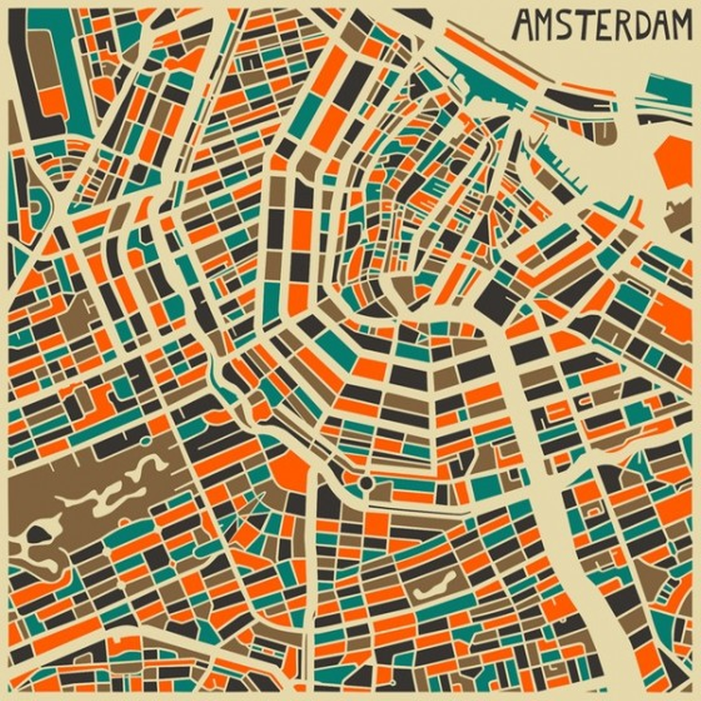
Artist Jazzberry Blue tends towards the creation of abstract works that centre on geometrical shapes and patterns. Maps have also provided a focus for many pieces of work as colour is used in an imaginative way to re-style the cities. Here, the shape of Amsterdam is clear with roads and canals cutting through a patchwork of bold colour whose palette is in perfect balance. While a traditional map prtrays the structure of a city it’s conventional use as a product to aid navigation, wayfinding or other spatial requirement dictates its style supports those functions. Artwork doesn’t have the same requirement and with the shackles thrown off, it gives us a wholly different way to view space and place.
These are no doubt maps but they are maps as an art form rather than for conventional purposes. You’d not be able to use them for wandering round a city…but they will likely look terrific hanging from a wall.
You can see many more examples of maps by Jazzberry Blue at the Jazzberry Blue web site here.
