Distilling a complex city like Milan into a map to support a 3-day trip to the city by a tourist unfamiliar with the area means additional constraints for the cartographic processes. The processes of selection and omission become vital, perhaps moreso than for a general purpose map which has the luxury of providing the scope to include more. Here, if you include more than can be reasonably navigated in three days you risk the user becoming frustrated, or perhaps trying to achieve too much.
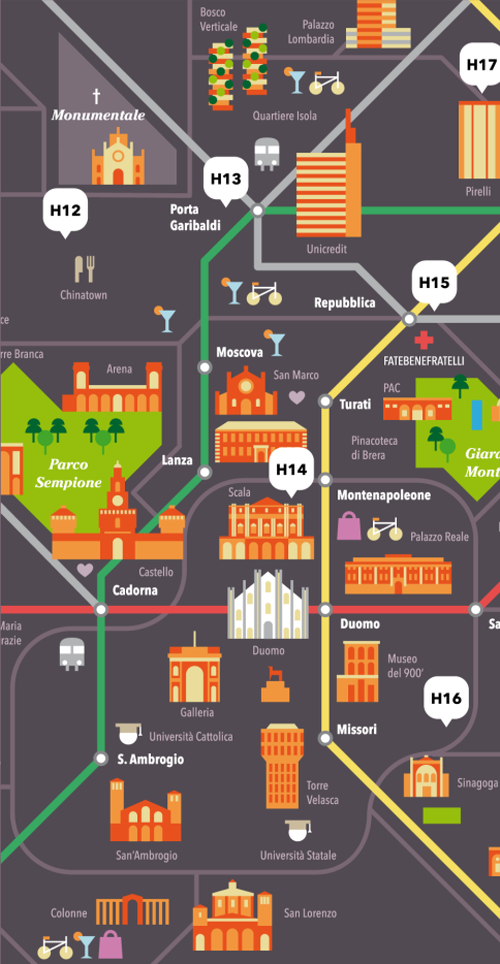
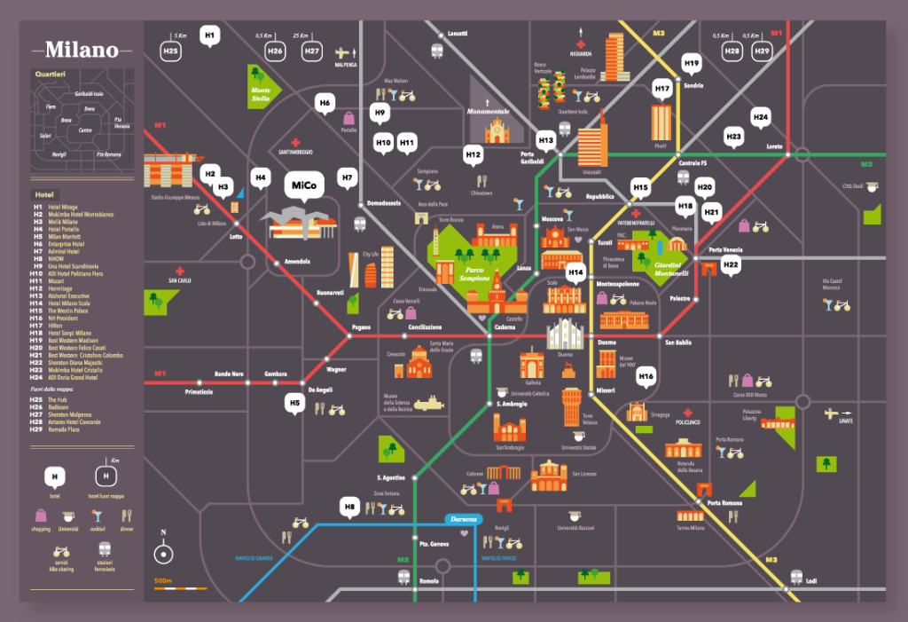
Matteo Riva’s work in graphic design and illustration sees him use simple geometric shapes and straight lines in much of his work. He uses a lot of saturated block colours and a lot of contrast. Typographic components are key to the overall design and play an important role. All of these facets are seen in his map of Milan. Clean, simple geometries and vivid use of colour creates a collage of the city. Key places are marked but the white space (grey given the background colour) shows how much is missing. The benefit is it gives the selected places space to breath on the map. None of the graphics is competing for space.
At a glance it’s obvious what are buildings or parks or roads or the subway. Underground stations and hotels feature prominently because they are the main hubs people traverse between and through.
The design supports the map’s purpose well and the unconventional graphic approach lends a certain character to the map that shows that different isn’t necessarily a bad thing in cartography.
You can see more of Riva’s illustrations and maps on his web site here.