Click image to view web map
We’re almost drowning in data these days. The impact of the various Open movements is seeing the unlocking and emancipation of so much data from both private and public bodies. This causes difficulties in a sense because there always seems to be a race to do the coolest visualization in the shortest amount of time with any new dataset…and that usually leads to some pretty poor cartography. Quality so often takes second place to speed and the desire to be seen to be the first to have published something. Occasionally though, we see a gem and this web map of U.S. daily temperature anomolies is one such example.
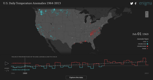
There’s a huge amount of data to be sifted and for an approach to displaying the salient characteristics to be determined. A minimalist map base works well – anything to simplify the experience and give the reader a fighting chance at understanding the patterns is going to help. Colour is also at a minimum with just reds and colds used to signify major temperature trends. A counter keeps us up-to-date with the date and provides a useful visual anchor. The patterns of flashing dots dance across the map and because they tend to appear in waves we don’t get the usual disorienting impact of flashing maps.
The data has been simply categorised to make it clear and instantly recognisable and the chart provides a useful way to position the map in time in relation to the longitudinal data. The user interface is well crafted and everywhere you expect functionality, you get it. The map has basic pan and zoom; the graph slider can be moved. The animation can be paused and you can change the animation speed. The best bit, though, is the map is just the beginning. The data can be explored and scrolling down the page reveals well written, digestible detail, again presented with clear graphics in a strong layout.
Web maps that use defaults tend to suffer. When you go beyond the defaults and really think about each element of your work you develop something that is clearly in a league of its own (carto)graphically.


