
Maps of point based data are all the rage in this open data landscape since most open datasets offer the location of a phenomena by latitude and longitude along with one or more characteristics. Often it’s just a location but that can still reveal insights when analysed and mapped effectively. A data set of all known locations of Starbucks may seem rather tedious because aren’t they on every street corner? Chris Meller took the data and David Yanofsky began mapping it revealing such gems as the location in the USA that is farthest from a Starbucks (Circle, in northeast Montana some 192 miles from the nearest Starbucks). There are 210 locations in Manhattan (slightly more than 6 per square mile) and if you drive from Boston to Philadelphia you’re never more than 10 miles from a Starbucks.
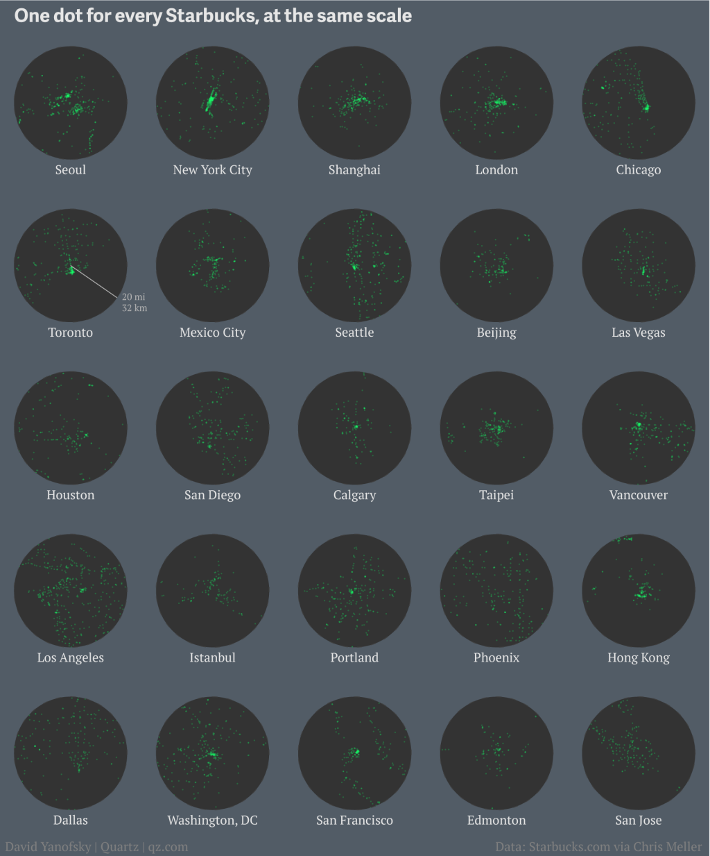
Beyond the factoids, Yanofsky has created some simple yet effective maps to display his findings, such as a map of the USA with a single dot for each Starbucks that pretty much reflects a map of population density. Of more interest here is the small multiples example where he uses a circle of the same size and scale to display the pattern of Starbucks locations in 25 major world cities. The map is well balanced with a 5 x 5 grid of maps. Colours are stark with a Starbuck’s green dot signifying locations against a black background almost like a radar screen.
The map may be simple yet what Yanofsky does he does well. He maintains clarity through symbology, shows a single theme well and uses layout to create a balanced structure. Above all, he is showing comparisons so his maps are each projected properly and use a consistent scale. This is paramount in any mapping application that purports to support visual comparison. Without the correct structure the message can be severely distorted.
Explore a full write-up and more of Yanofsky’s maps in his cartographic guide to Starbuck’s global domination here
