
 There’s something very appealing about a well composed thematic map. The geometric character of the symbols often used as an overlay gives the work an abstract aesthetic whether they are draped across a real map of the world or not. Of of the central tenets of good thematic map design is that the underlying geography is really just a placeholder. Providing topographic detail is really nothing more than a distraction to the main event. The most explicit illustration of this is when the base map is disregarded altogether.
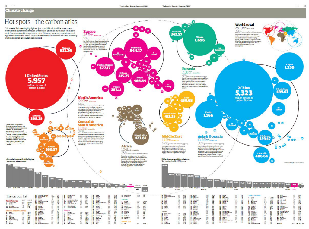
Here, The Guardian use a Dorling cartogram based on proportioanlly sized circles that convey both quantity of the phenomena being mapped as well as the geography itself. There’s no need for a base map as the position and adjacencies of the symbols work perfectly to tell the story. Cartograms are not to everyone’s taste though and they tend to find more favour outside North America than within which is in itself curious. They are often reserved for reporting of election results when the size and shape of real areas is secondary to the proportion of vote and the amount of red or blue one wants to paint across the map in true proportion.
They are also more heavily used in the media precisely because they are visually striking and attention-grabbing. The strong geometry coupled with bold colours used to differentiate between continents is particularly impactful. There’s a really good hierarchy of detail in the map from the large simple symbols through the typographic components providing facts to the small-print where we can read a little of the story. There’s a useful legend in the top right that relays the colour coding as well as an overall measure and the graphs and country list at the foot provide detail for those wanting to mine it.
A strong print graphic that The Guardian has used in subsequent years to good effect when updating the information.
