
 Maps based entirely on typography are abstract representations of a landscape and have been used effectively as fills for land use and through repetition for linear networks. There’s a lot of them about. They are certainly artistic and it’s fascinating to effectively just use what we used to call the names plate to show a geography that doesn’t actually exist on the ground. Map text takes up a considerable amount of space on a map. It adds meaning and allows us to interpret the landscape using labels and descriptions that we understand.
Type functions literally as well as to locate mapped features. This example, by NB Studio, was one of the first to gain wide attention and remains one of the most accomplished. Prepared for The London Design Festival in 2006 as a commentary on social space, the large format poster went on to win the design week awards in 2007. The map shows only names of locations, streets or places. Larger fonts reflect more important spaces with smaller fonts representing a less celebrated space. Smaller type is used as a replacement for roads and view at a distance, the structure of the city emerges as the form, orientation and positioning combine to create landmarks and shapes that can be easily identified.
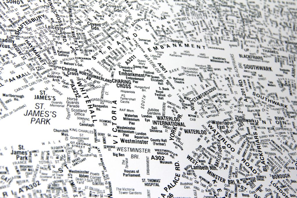
The map is a great example of the power of typography in map-making and also illustrates how effective a single colour can be. Maps do not always need to be in colour to be visually stunning or effective. Indeed, this map shows you don’t necessarily need points, lines or areas either! The title is both clever and gives the work character to provide a rounded product.
The poster can still be purchased via NB Studio’s web site here.
