
 Not strictly a map but Bran Eno’s seminal work carries a map as the album sleeve and it’s as much a part of the package of the work as simply the music itself. As the first in Eno’s Ambient series (each of which had map-like sleeves) the album was composed to provide a relaxing, soporific counter to the hustle and bustle of the modern airport. From the moment you begin a journey, packing everything yet managing to forget that crucial item; through the battle of merely getting to the airport, parking, checking-in and negotiating the inevitable security line, Eno’s audio is designed as the antidote. As you sit back in your own piece of tiny real estate of the aluminium can the music helps soothe the pain of modern travel. Eno exposes the lack of romance to modern travel as we’re swept away in a world of audible delight but the experience begins with the album sleeve.
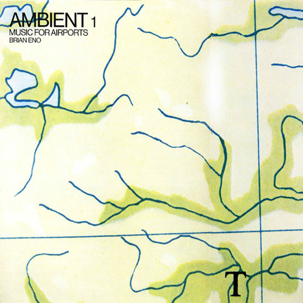
The map is a fundamental element of the overall package. It’s simple and plays well as a visual accompaniment to the music. It depicts the hazy out-of-focus view we get from high altitude as we crane our necks to make sense of the vastness below. There are few cities; few urban places that cover the earth; and we tend to use air travel to traverse the voids in between…deserts, plains, mountains and oceans. Here, the cover shows little more than a desolate landscape criss-crossed by rivers. It’s distinctive, abstract cover art designed by Eno himself. There’s a network of tendrils that may be rivers…they may equally be tree branches, or lines on an ancient map. There’s differences in colour that may relate to land use and there’s even lines that suggest a graticule. The palette of colours is equally simple and muted with earth tones that are designed to allude to nature and the peace and tranquility that it provides in contrast to the sterile surroundings of an airport.There’s an uppercase T in the lower right giving a nod to some abstract, un-named place but the map has no labels because, of course, labels do not exist in real life. Instead, we’re left not knowing where we are or what the various features are that we can barely make out.
It’s at the artistic end of the cartographic spectrum for sure, but maps make very good art and this example shows how the design of the imagery for the album creates a package that allows you to listen with your eyes before you even plug the headphones in. Happy Flighting!
