
View the online map here
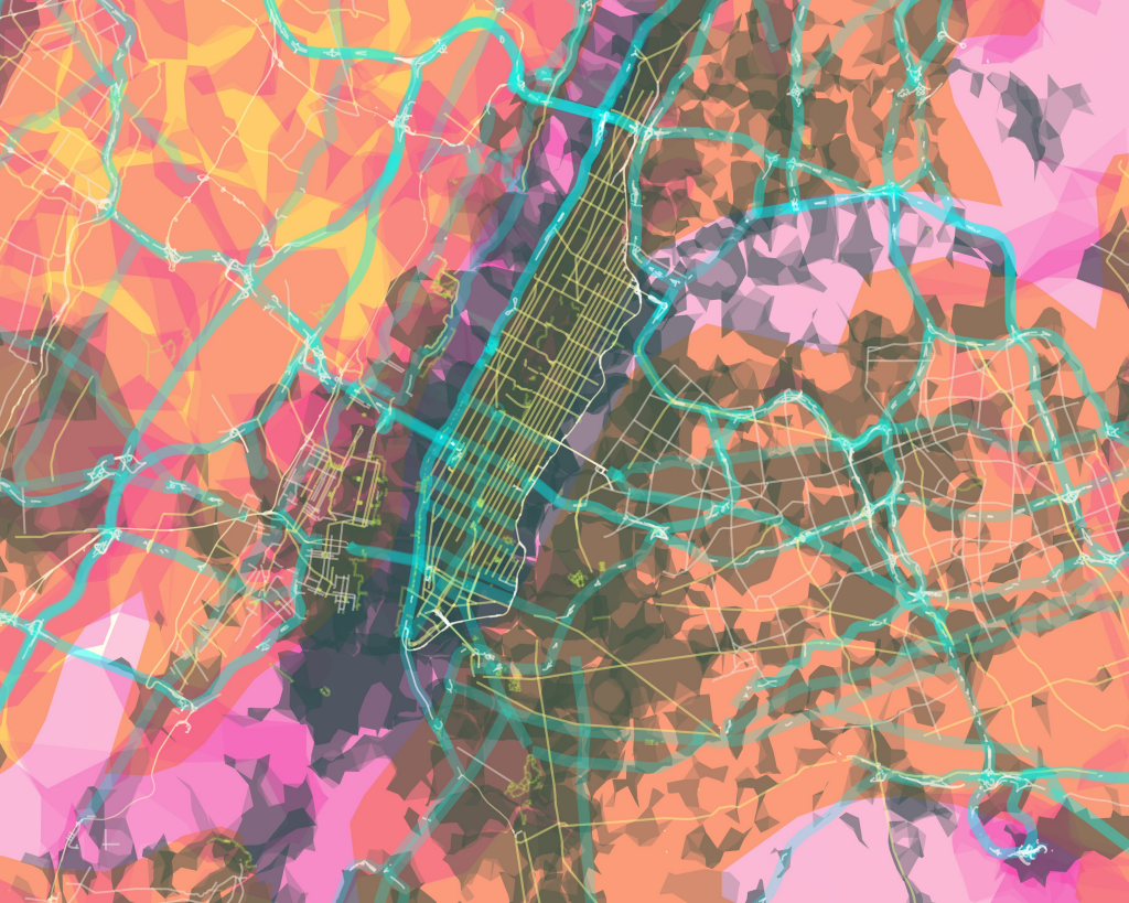
Described as an ‘experimental design’, Stamen have thrown away the rule book with this example of styling digital data to the extreme. It’s not so much a map as a work of art taking many aspects of modernism and applying it liberally to the data. It owes much to artists such as Jasper Johns who made the map of the U.S.A. famous when he used it as a basis for his own experiments with abstract map imagery (MapCarte 3/365)
Virtually every aspect of this map is counter to how you would typically style features with bright contrasting colours and angular shapes yet hiararchy of features is preserved, they are recognisable and can be distinguished from one another in the landscape. The map is not especially useful as a backdrop for other thematic detail yet the point of this is to explore ways of re-imagining the map and challenging our preconceptions of map design.
It has a strong aesthetic and although rendered as an online map, the beauty of this work is not necessarily as an online map – as it makes heavy weather of rendering in the browser – but the style it deploys.
