

Not the only map of the internet but his well produced schematic maps the most influential internet domains and people onto the Tokyo Metro map. Each domain is assigned to individual stations on the map in ways that complement the characters of each. Complementary websites are grouped to a line that suits it and the map produces inter-linkages among companies in multiple ways inspiring some intriguing interplay. For instance, Twitter is assigned the station with the biggest ‘buzz’ and Google is mapped at Shinjuku which is the world’s busiest station.
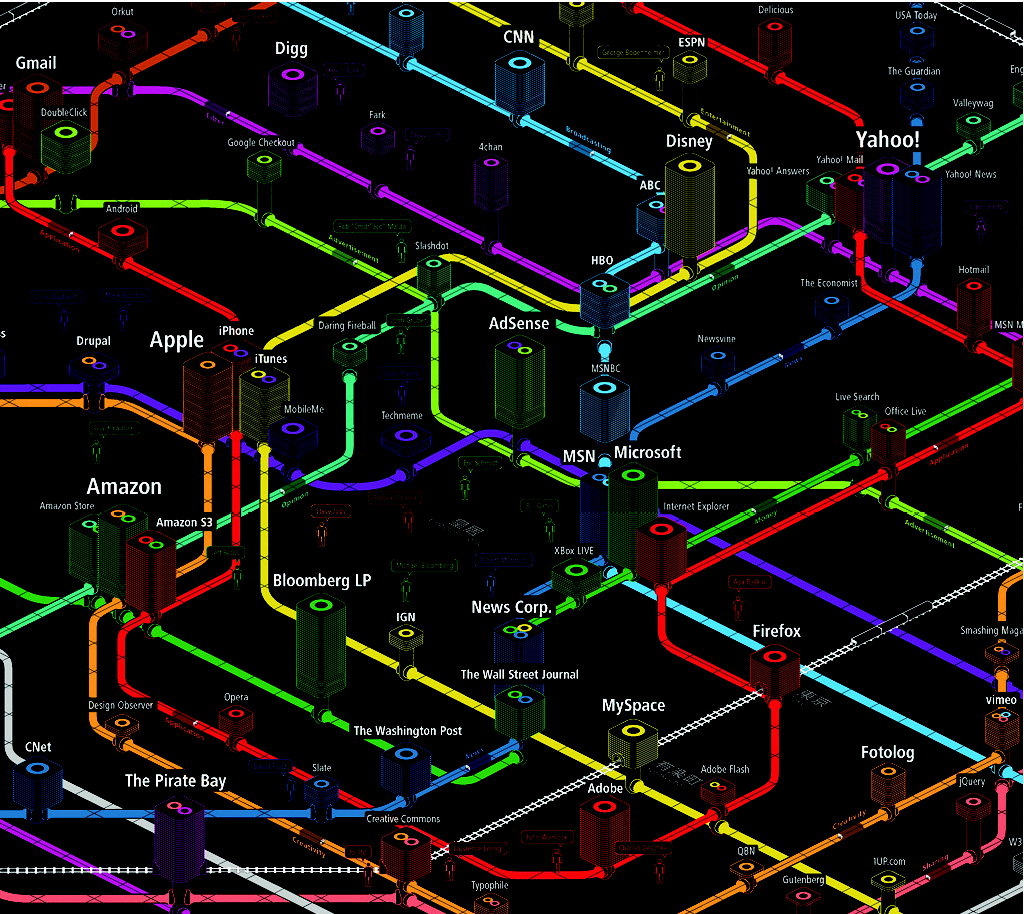
Web domains can be evaluated based on their position (proximity to a main line or hub representing importance), height (success measured in traffic, revenue and media attention) and width (stability as a business entity). The axonometric gridlines define street level with all subways positioned below the gridded surface. The Trend Setters are labeled using speech bubbles as if they are saying their name and other labeling works well to support differentiation of major trends. The colour palette is extraordinarily vivid and works well against pure black. Why map the internet in this way? As iA say themselves: because it works.
